Keep the mark, add the rules.
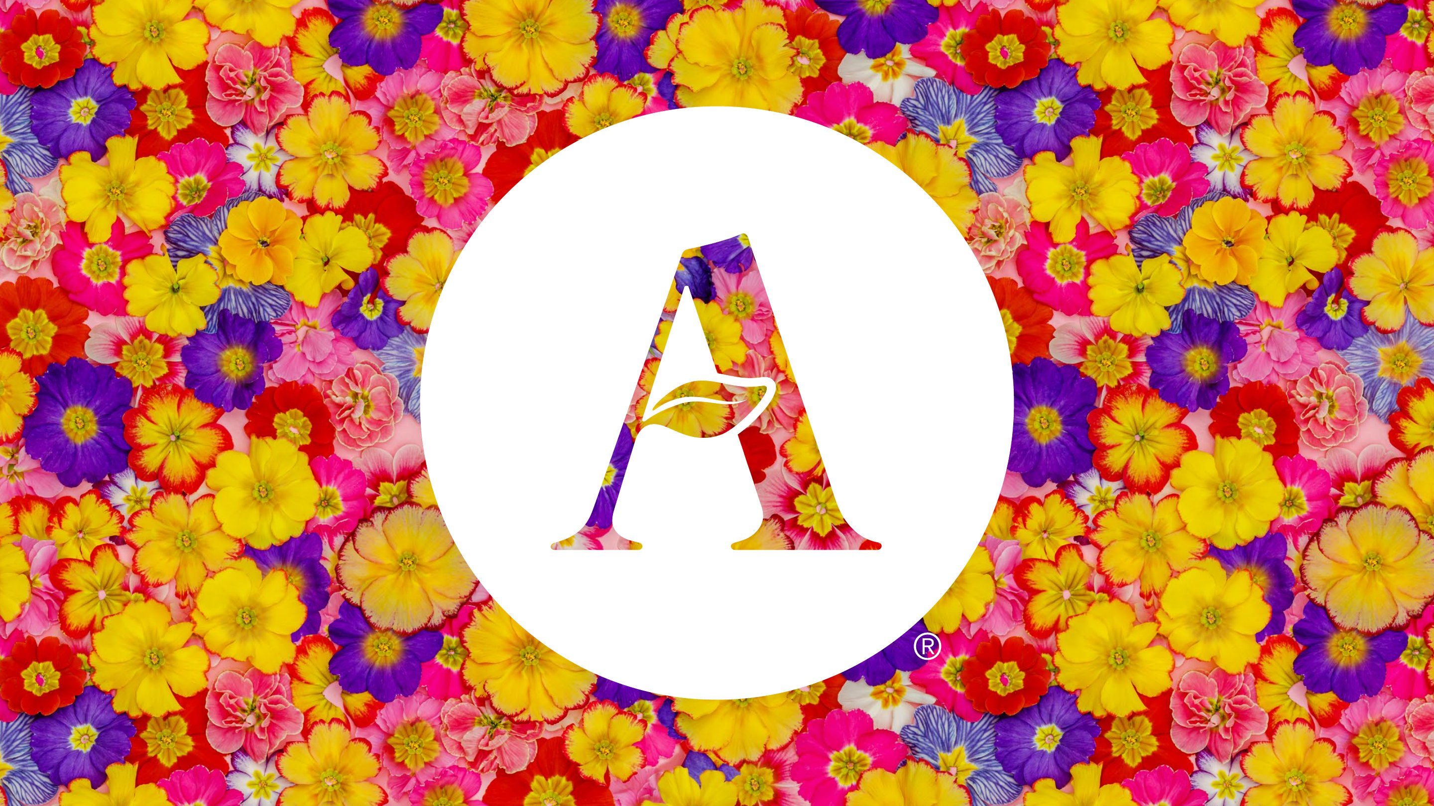
I set out how the existing colours relate to each other and built a graphic language from the radius of the A, from a full circle down to a quarter. It’s new without being unfamiliar.
Case study 03 of 06
Almondsbury wanted to feel more premium and be easier to shop.
The site had grown over the years, and so had its signs, offers and notices.
The brand didn’t need replacing. The red A and the colours were already known locally. What was missing was a rule for using them. So the rebrand kept the mark and the colours, and gave everything a single principle: simply. Simply seasonal. Simply signposted. Simply a better shop. It is a way of working, not a strapline. As the positioning put it: We are Almondsbury. Simply that.
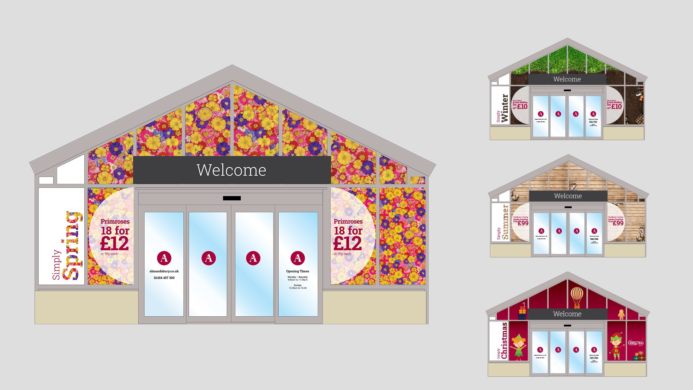
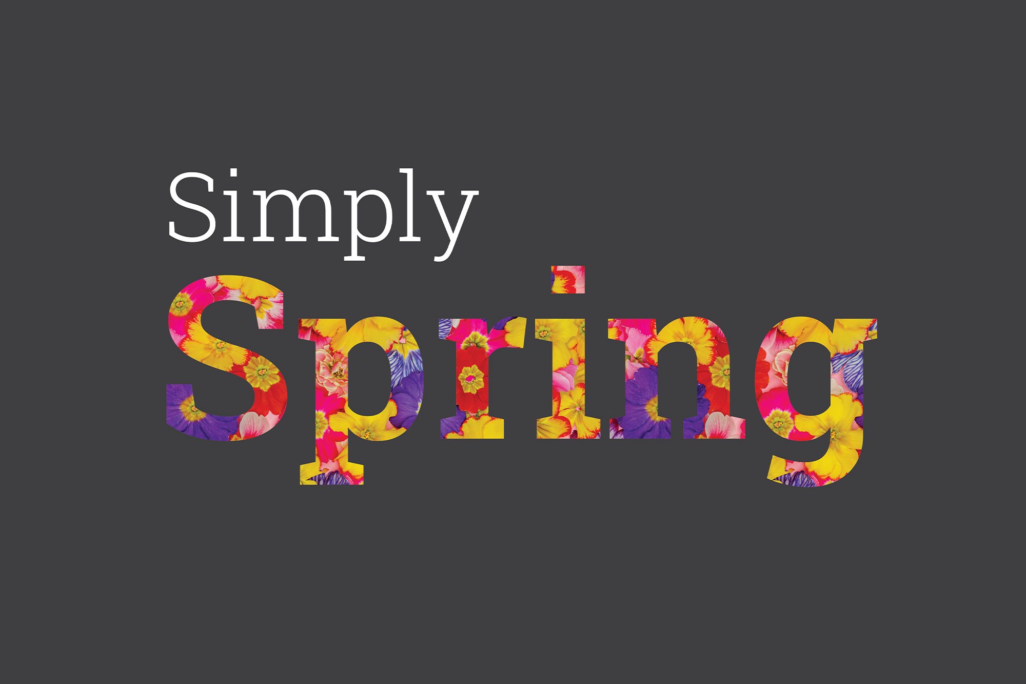
One fixed structure, dressed by the seasons. The shop front, signs and print share the same frame, built from the curve of the A. The content changes from primroses in spring to timber in summer, autumn leaves and then Christmas.
Customers see a garden centre that changes with the year, and staff get a system they can run without starting again each season.
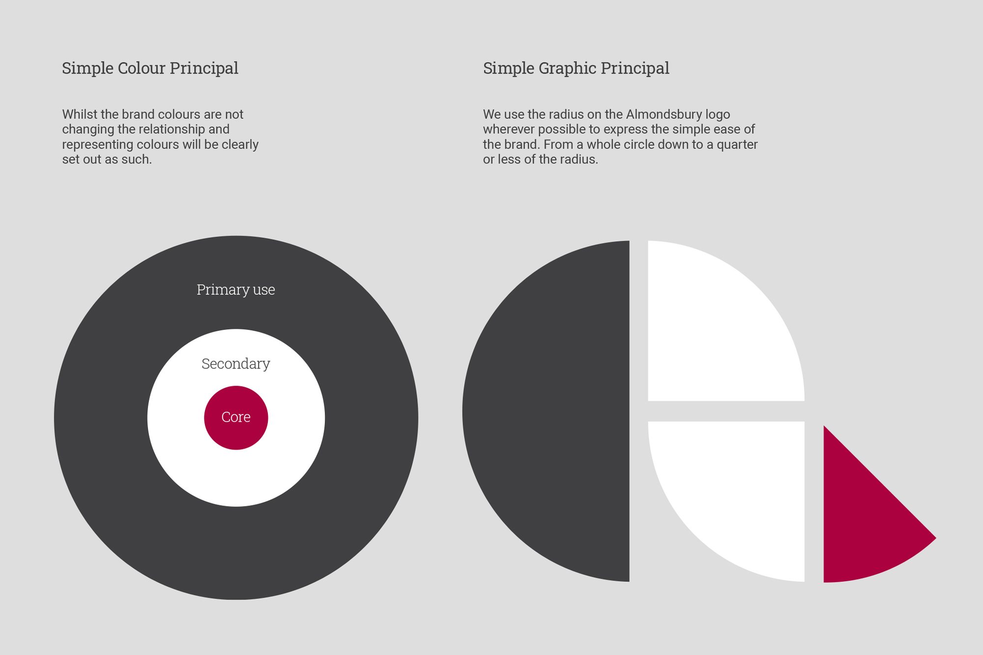
I set out how the existing colours relate to each other and built a graphic language from the radius of the A, from a full circle down to a quarter. It’s new without being unfamiliar.
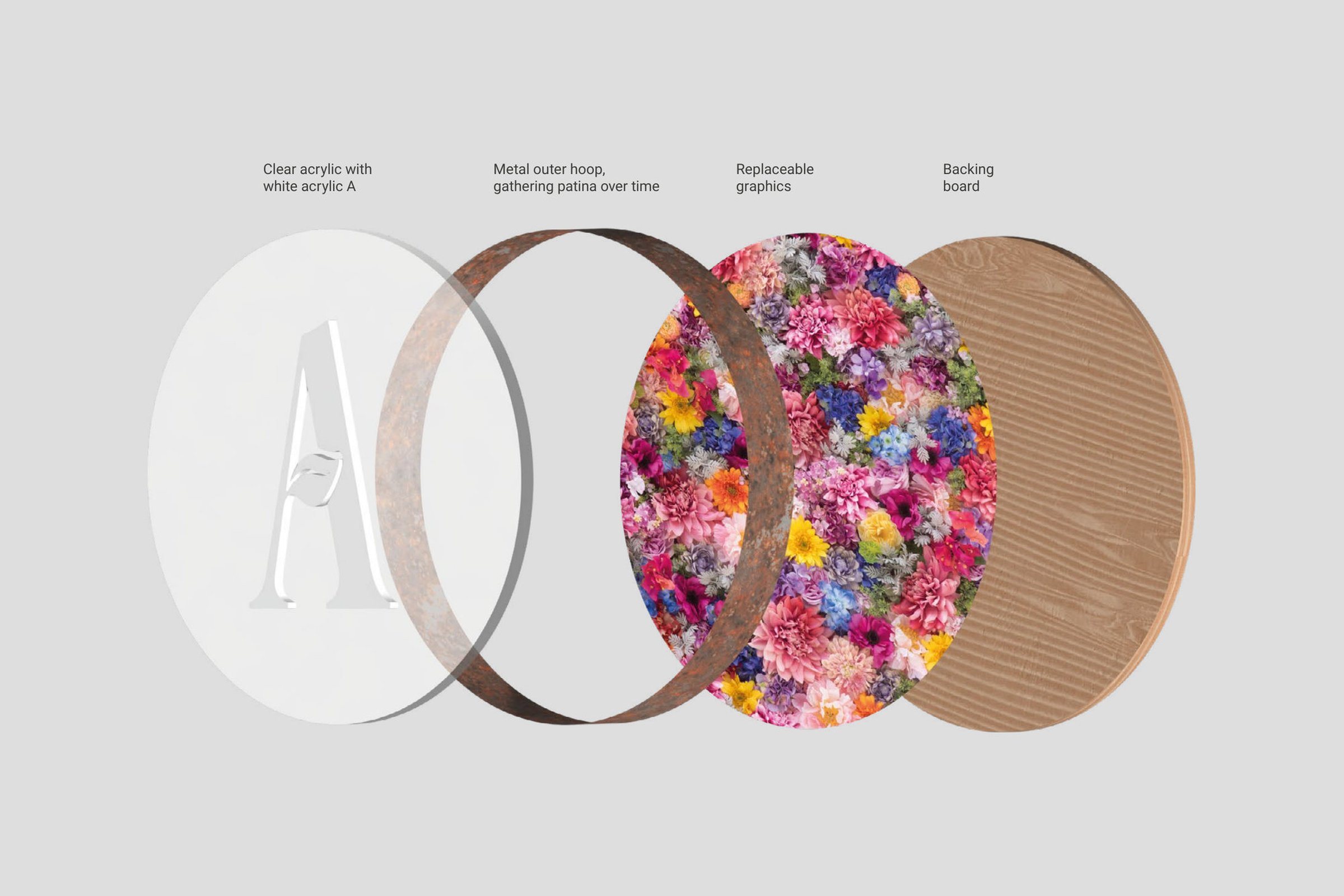
The Show Stopper A is clear acrylic with a white A, set in a metal hoop that gathers patina over time. Its seasonal graphic panel swaps out behind. Natural materials suit a garden centre better than gloss.
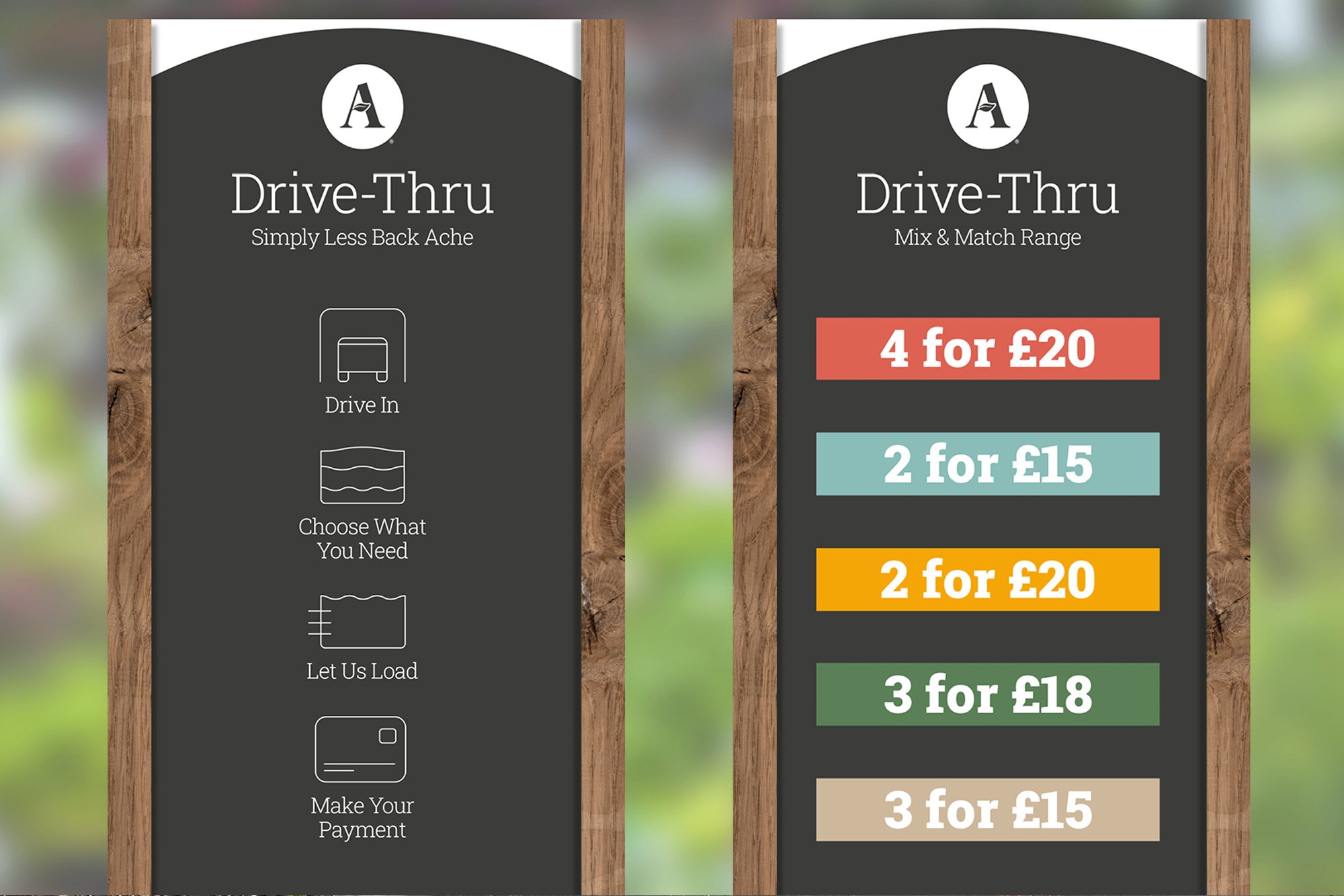
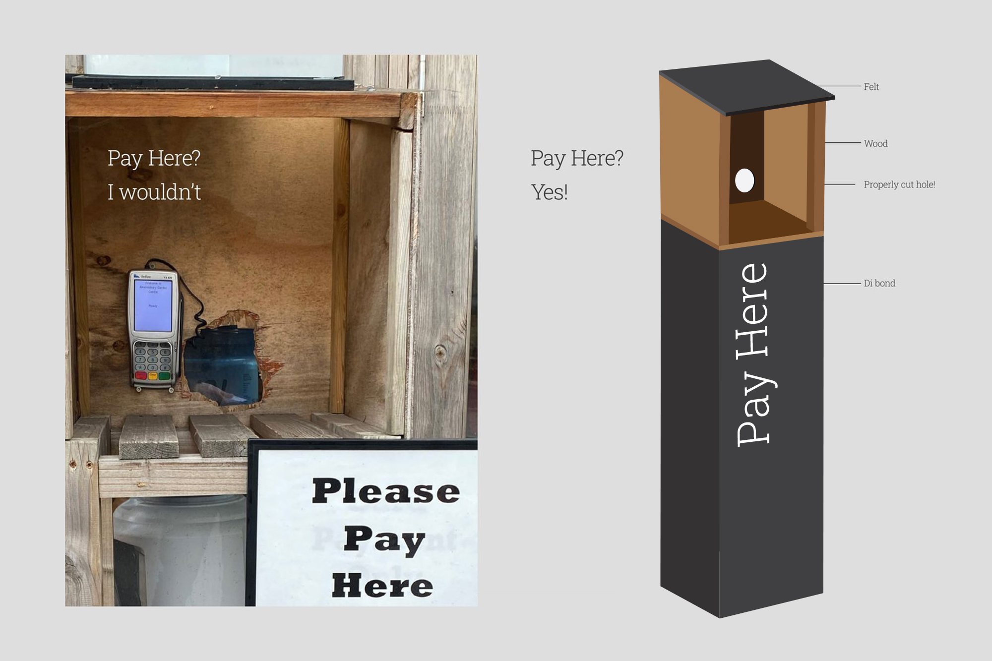
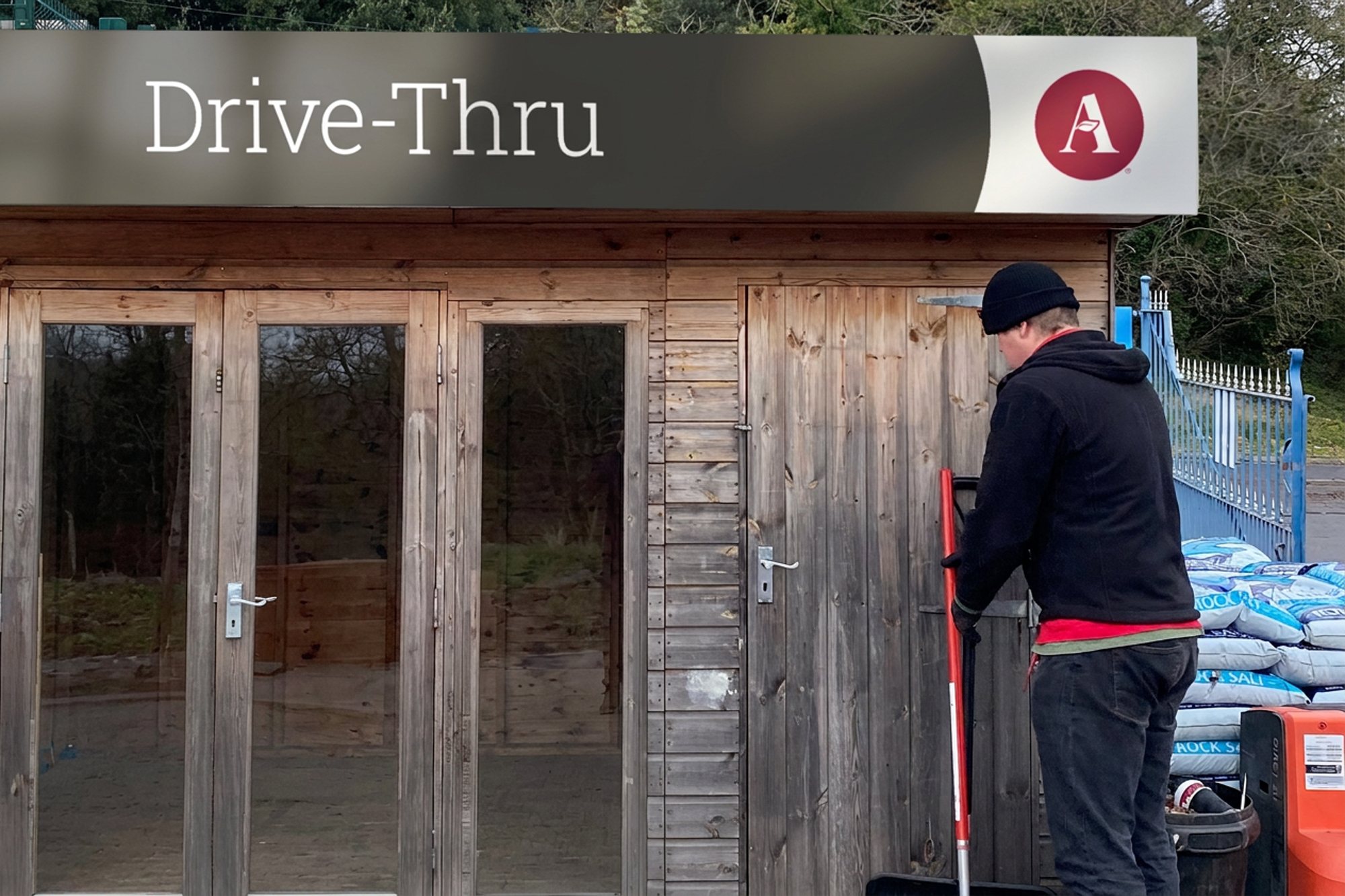
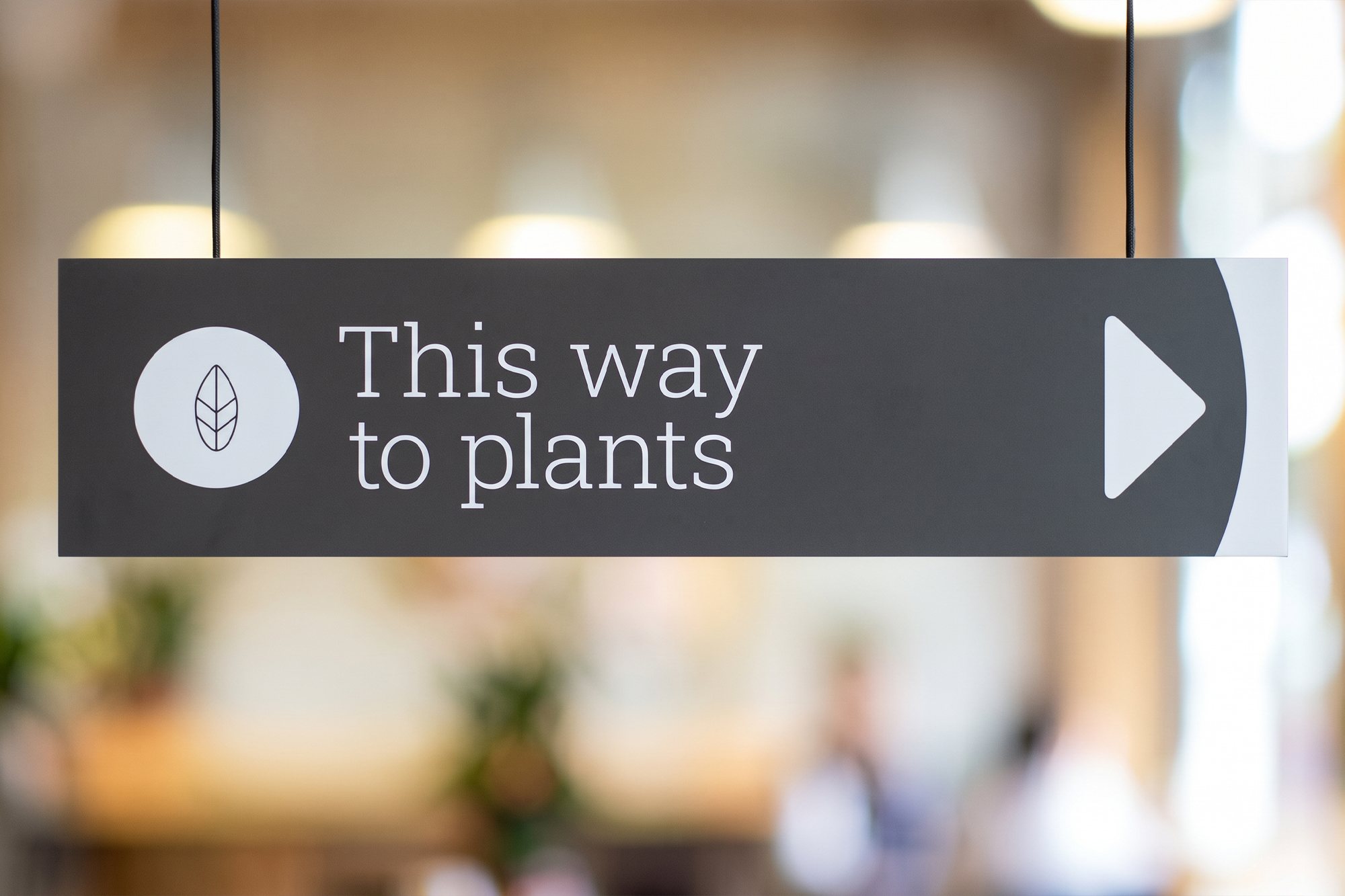
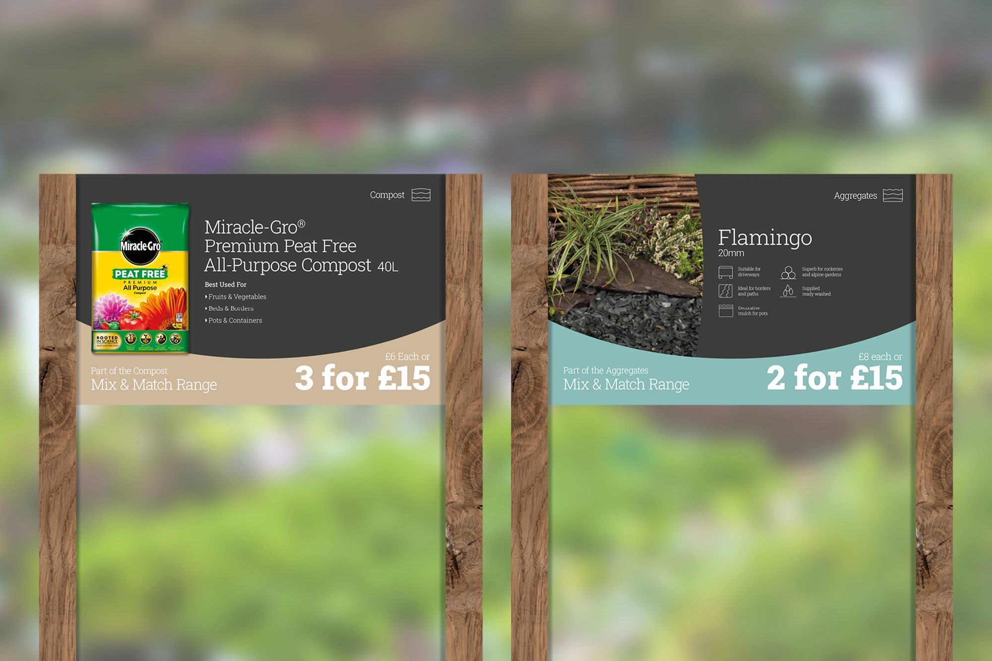
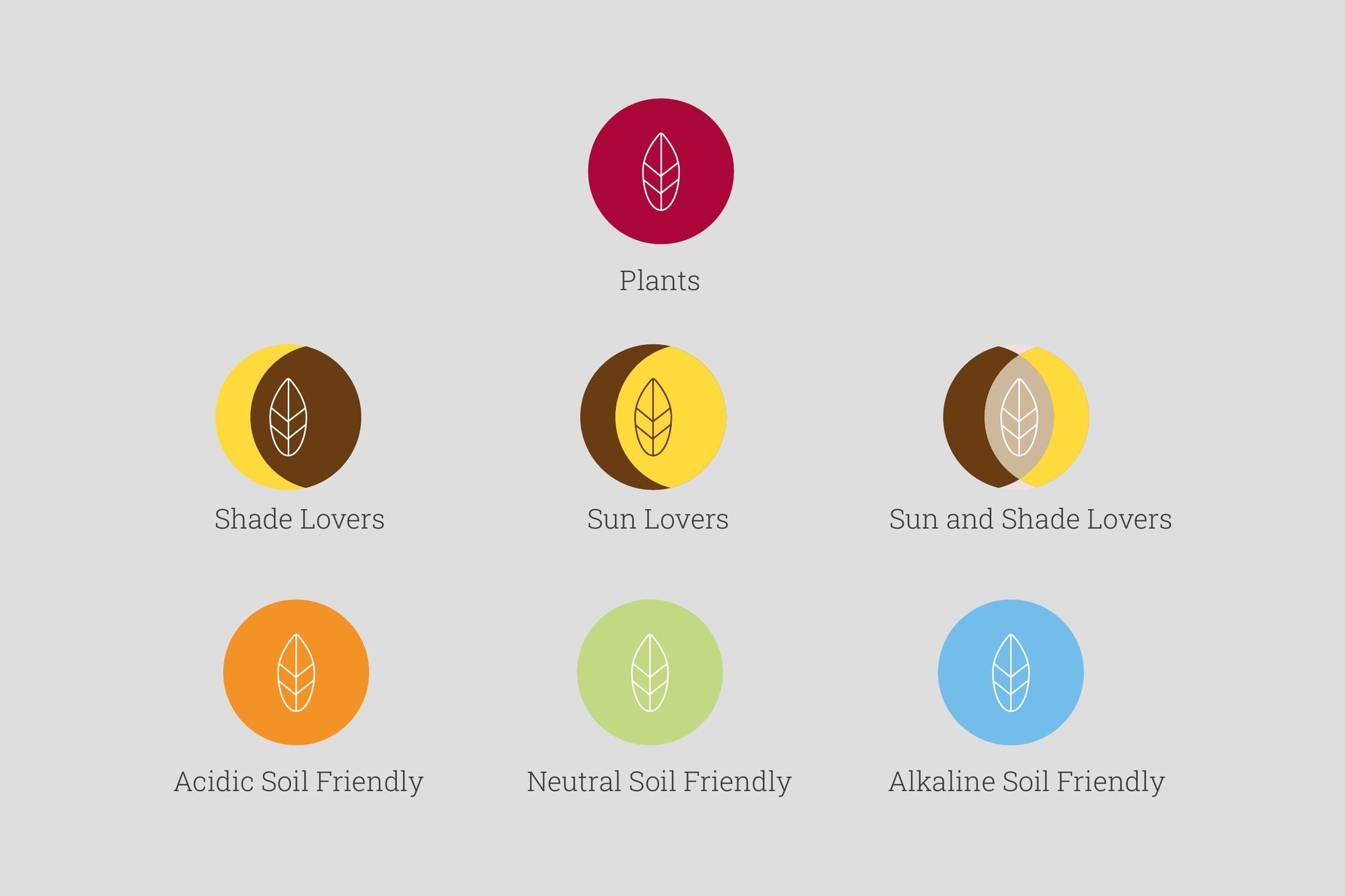
The compost and aggregates yard became a Drive-Thru, Simply less back ache, with four steps from driving in to paying. The pay point went from a handwritten notice to a proper post. Plants are signed by what customers need to know: sun, shade and soil type.
I led the design of the positioning, brand system, shop front, Drive-Thru and wayfinding, directing two designers, with the creative director and client services alongside.
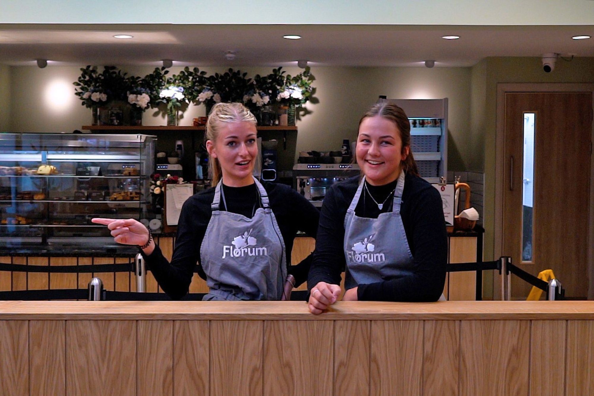
Two years later came Florum, the café inside the garden centre. The name came from another designer in a round of concepts. Once it was chosen, I broadened it into the brand: a blossom mark, Cooking Apple Green and Charcoal, menus, ordering signs and staff aprons.
The system was built. A TV planter sign stayed a concept. Florum opened in 2023 with its own identity, and Almondsbury is still a client. I’ve designed their Christmas windows since. The latest wraps the whole shop front as a present.