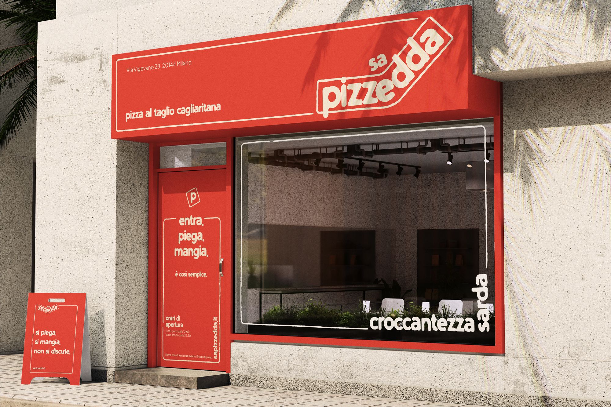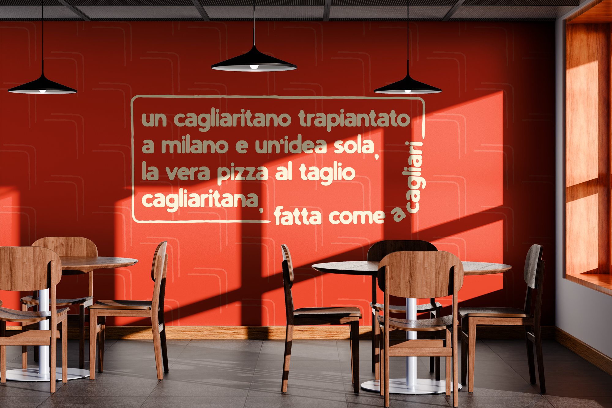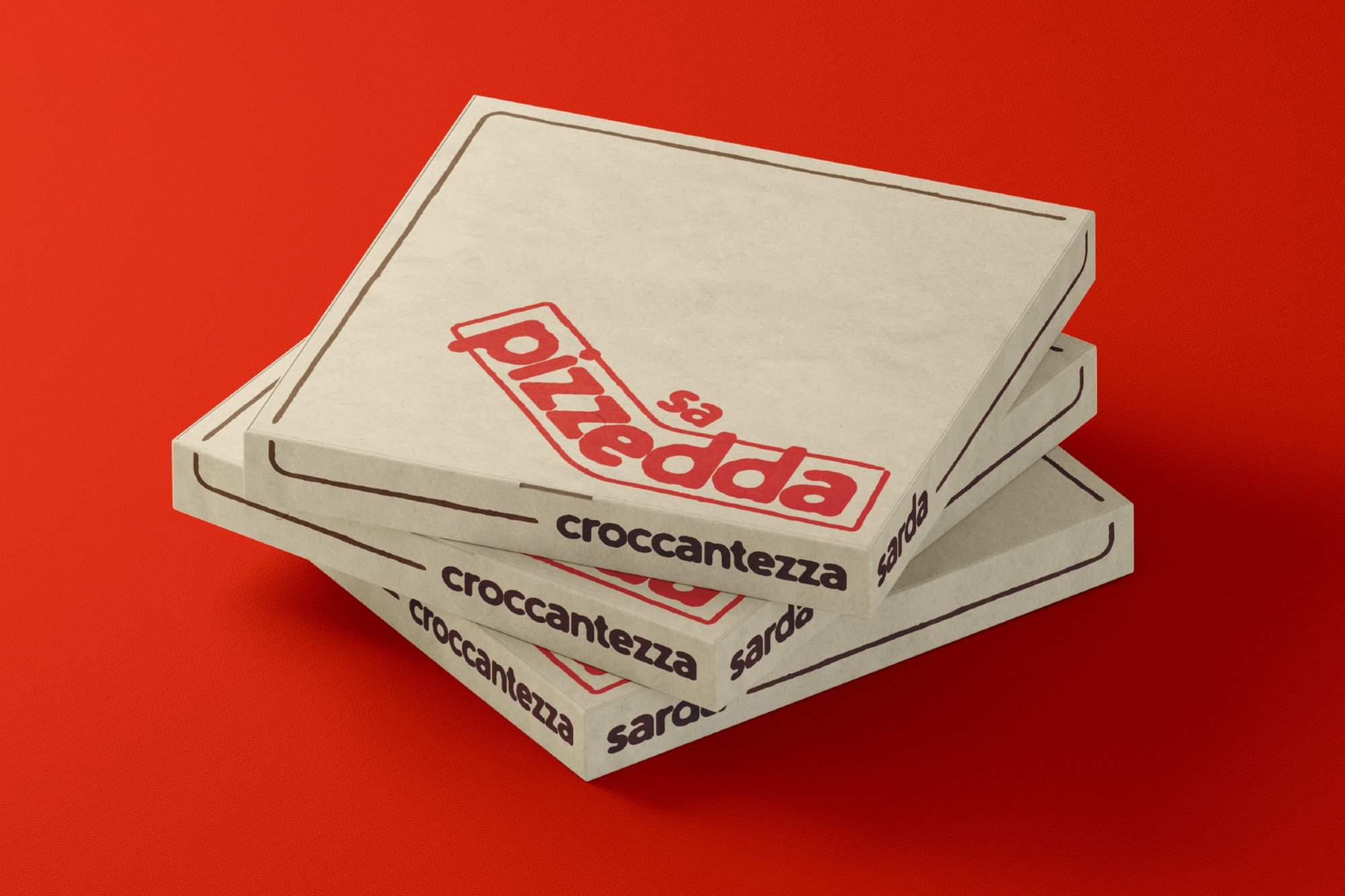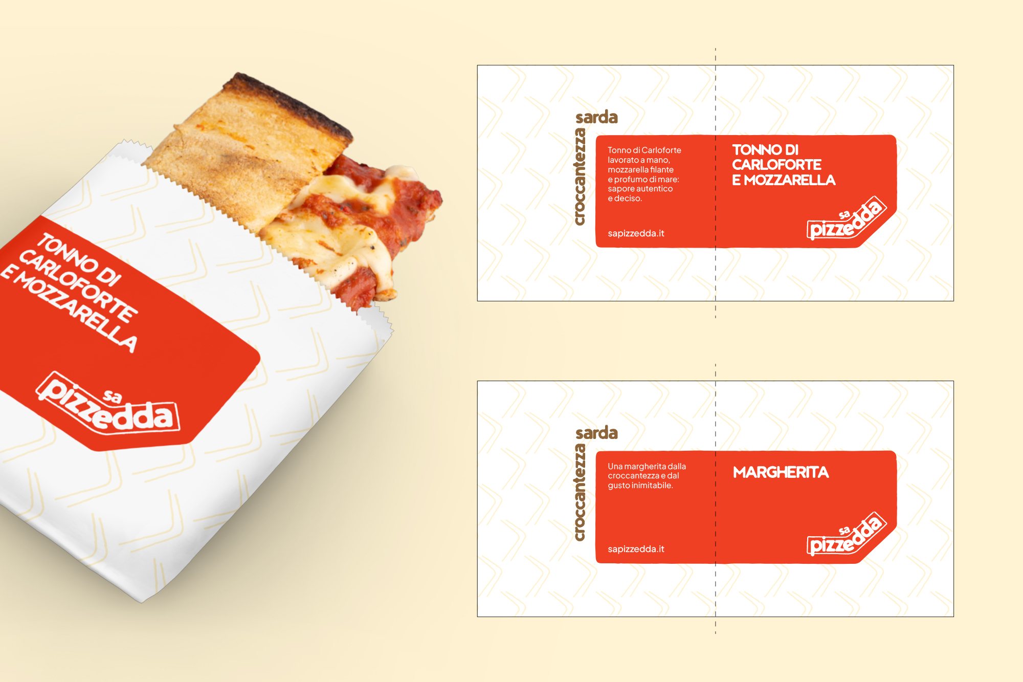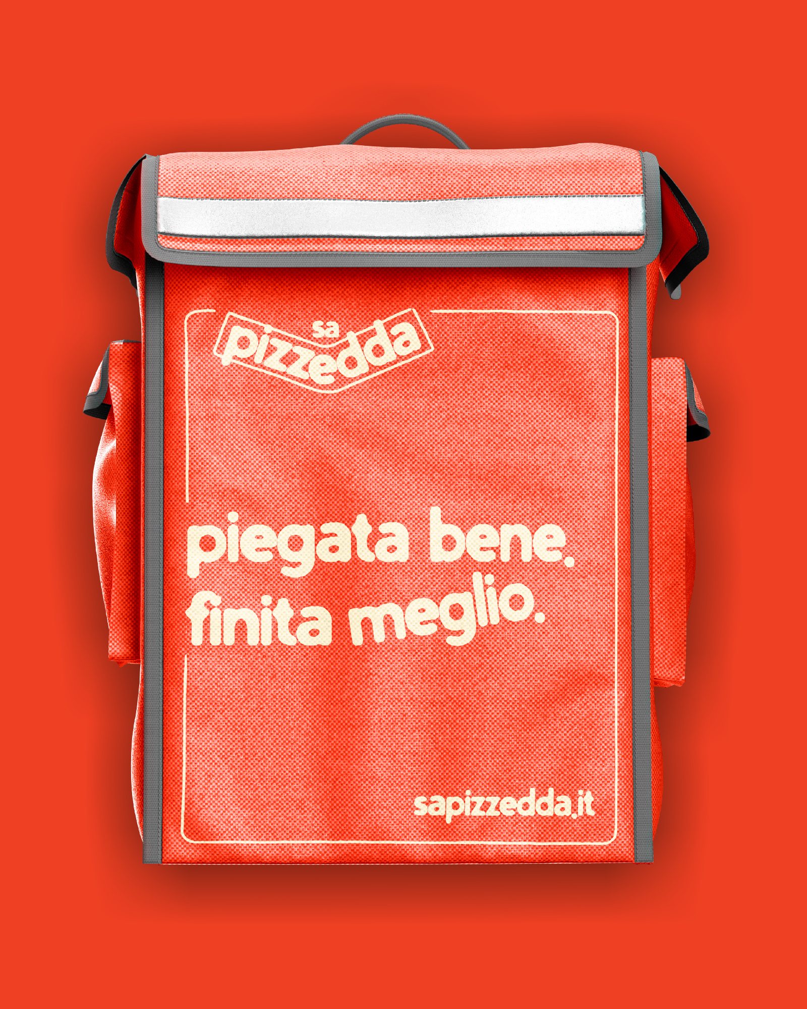
A system, not a single logo.
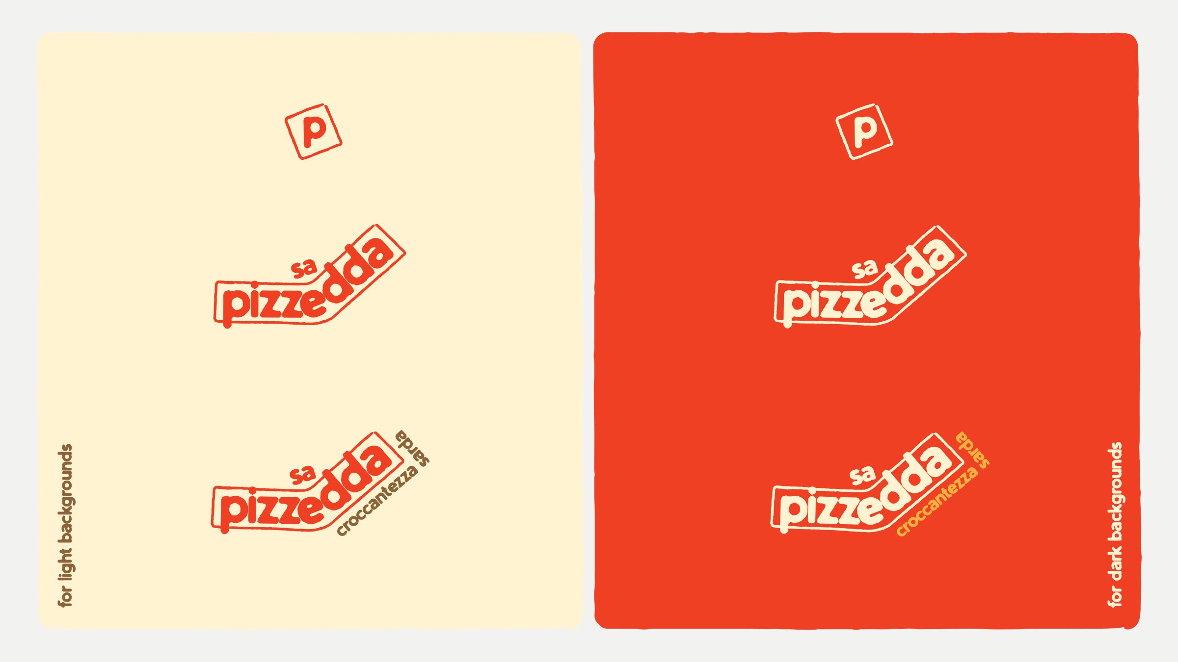
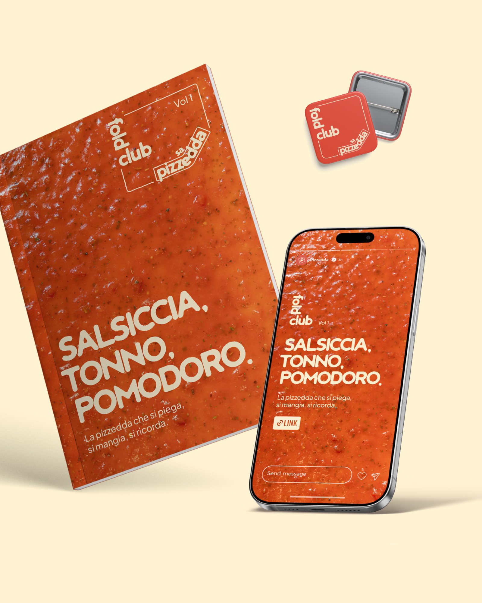
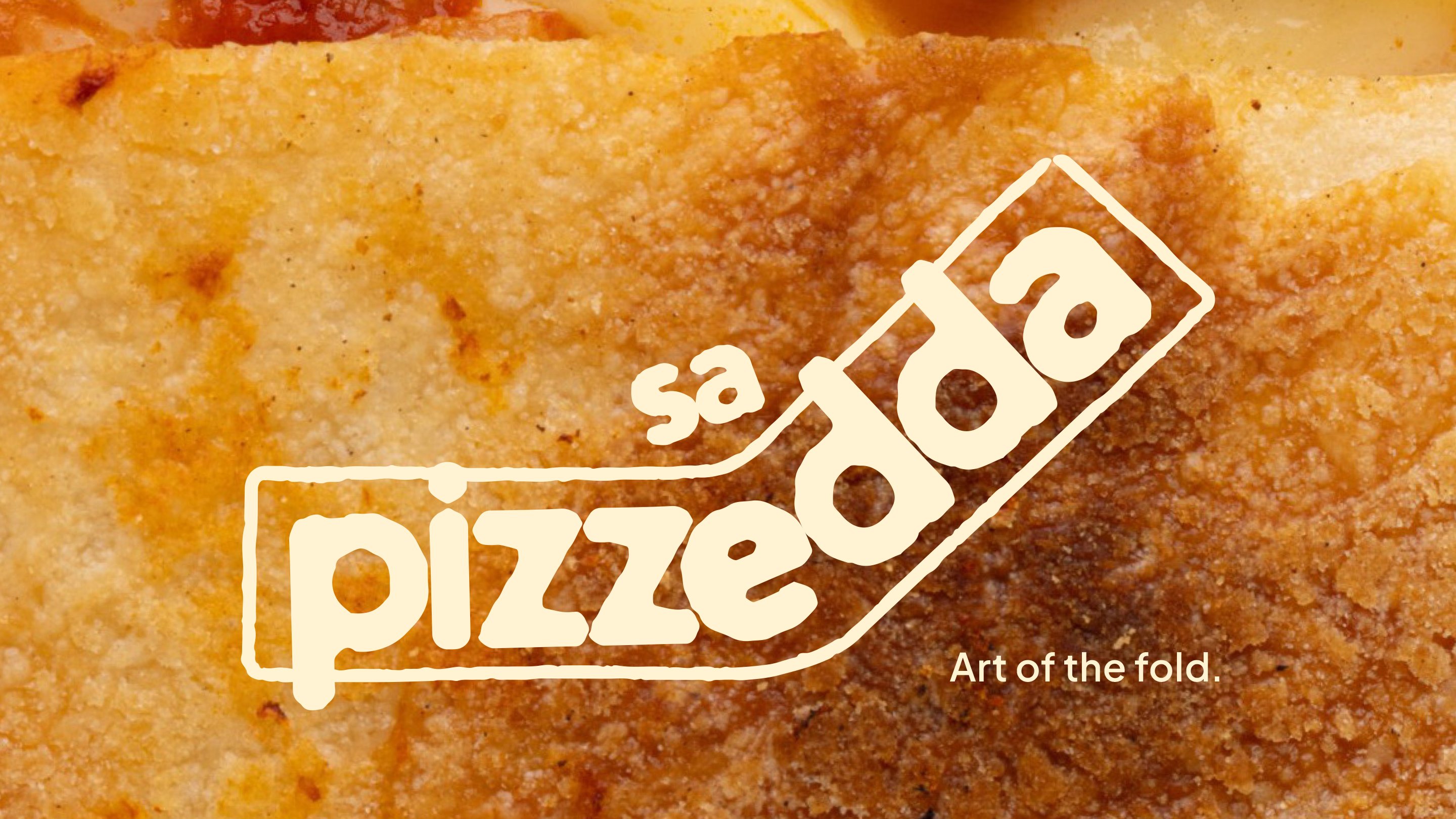
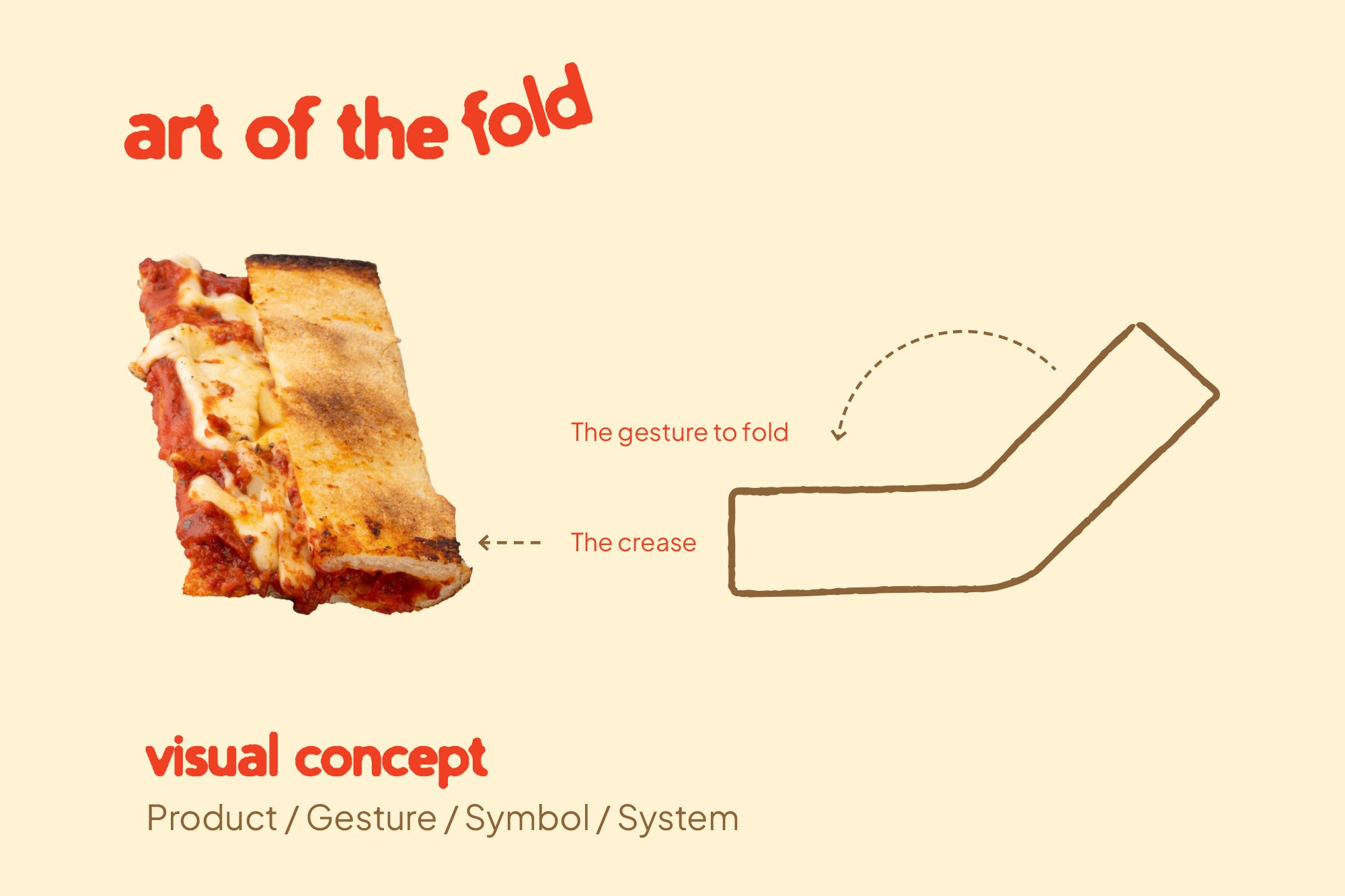
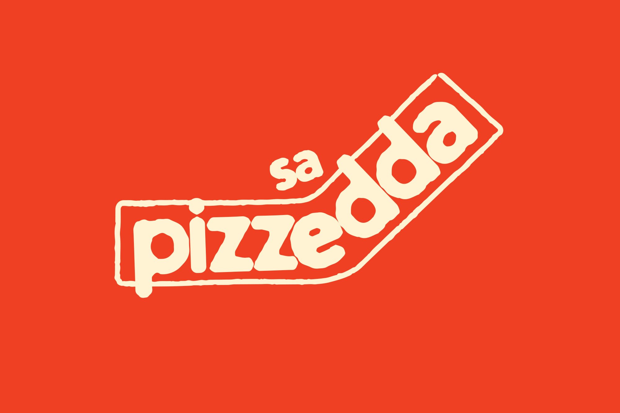
The brief asked for something broader than a logo. The folded mark leads; a lock-up adds the descriptor croccantezza sarda, Sardinian crunchiness; and a framed “p” tile carries the brand where the full mark won’t fit, from stickers to social avatars.