Stephen Donohue

Case study 06 of 06

Established, without looking traditional.

Client
Bridge, fund finance platform
Year
2025
My role
Creative lead: discovery, identity, art direction, rollout
Team
Me; a creative director on copy; a digital designer; the development team; client services
Disciplines
Identity, digital, editorial, presentation, motion storyboard
A cyan-to-violet gradient with two floating spheres and the line Fully focused on fund finance. No one connects like us.
The gradient and spheres, carrying the brand line.

The brief

Bridge connects fund managers with lenders. It needed the reassurance of established finance and the pace of a modern digital business.

Most fintech brands only manage one of the two.

The centre

The name already does the work. A bridge is old and solid, and it exists to get you across faster.

The idea

Two visual worlds that meet. Black-and-white photography of real bridges gives weight and credibility. Gradients and floating spheres give momentum. The B mark joins the two.

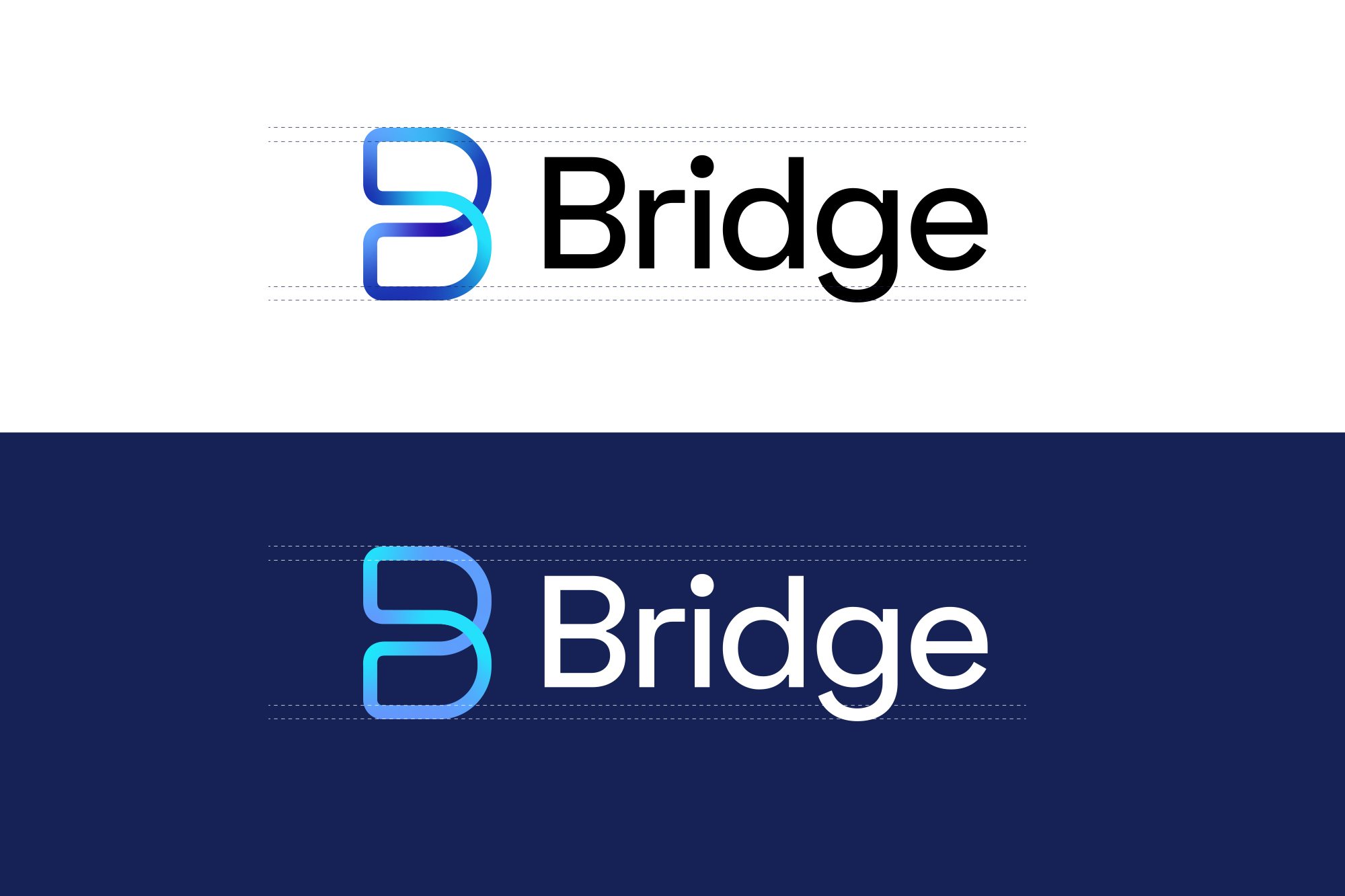
The Bridge B mark and wordmark, on white and on navy.
The mark, light and dark.
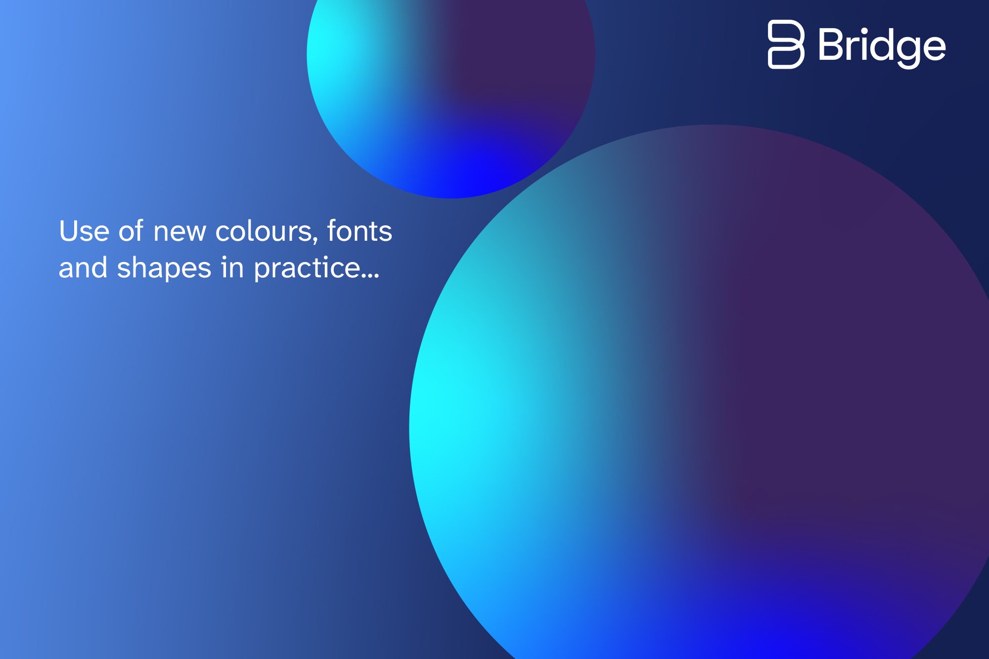
Blue gradient with floating spheres and the line Use of new colours, fonts and shapes in practice.
Gradients and spheres for pace.

Three decisions

Photography for trust, gradients for pace.

Each half of the brief gets its own visual language, and the system decides where each one leads. The presentation cover puts both in one frame.

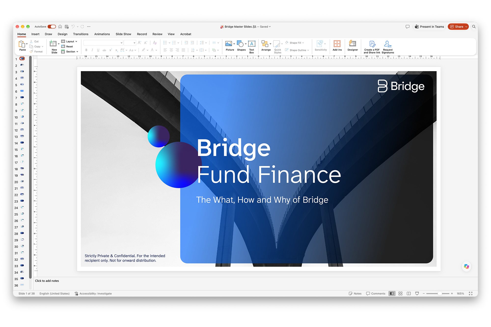
A black-and-white bridge seen from below, with a translucent blue gradient panel and two spheres over its centre.
Photography and gradient in one frame.
The Bridge presentation template open in PowerPoint: a black-and-white bridge under a blue gradient panel, titled Bridge Fund Finance.
The presentation template, in PowerPoint.

Atkinson Hyperlegible for type.

It was designed by the Braille Institute so that easily confused characters stay distinct. That’s exactly what matters in a product made of figures, rates and fund names.
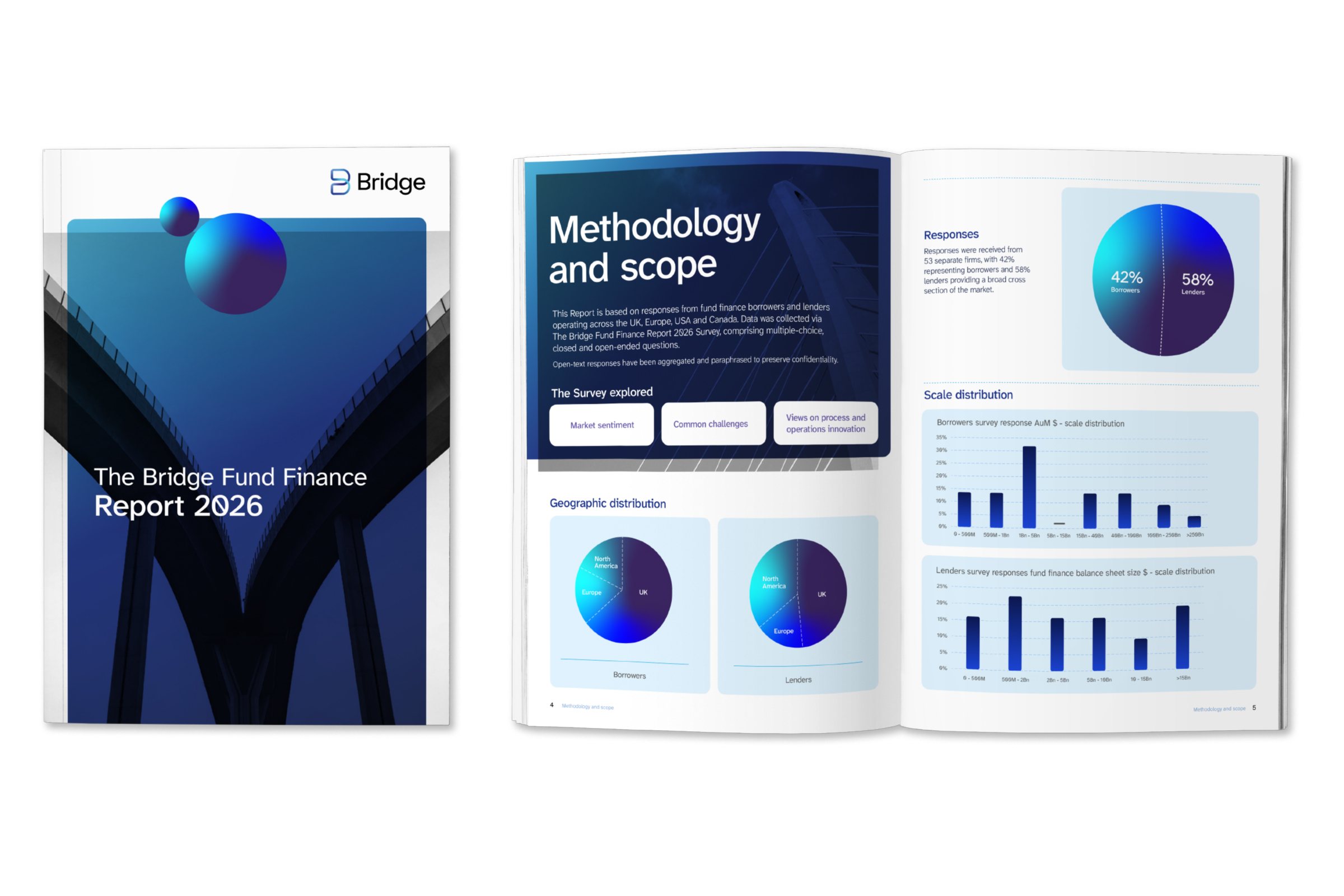
The Bridge Fund Finance Report 2026: the cover, and a methodology spread with charts and sphere graphics.
The 2026 report. Figures that have to read at a glance.

The brand doubles as the interface.

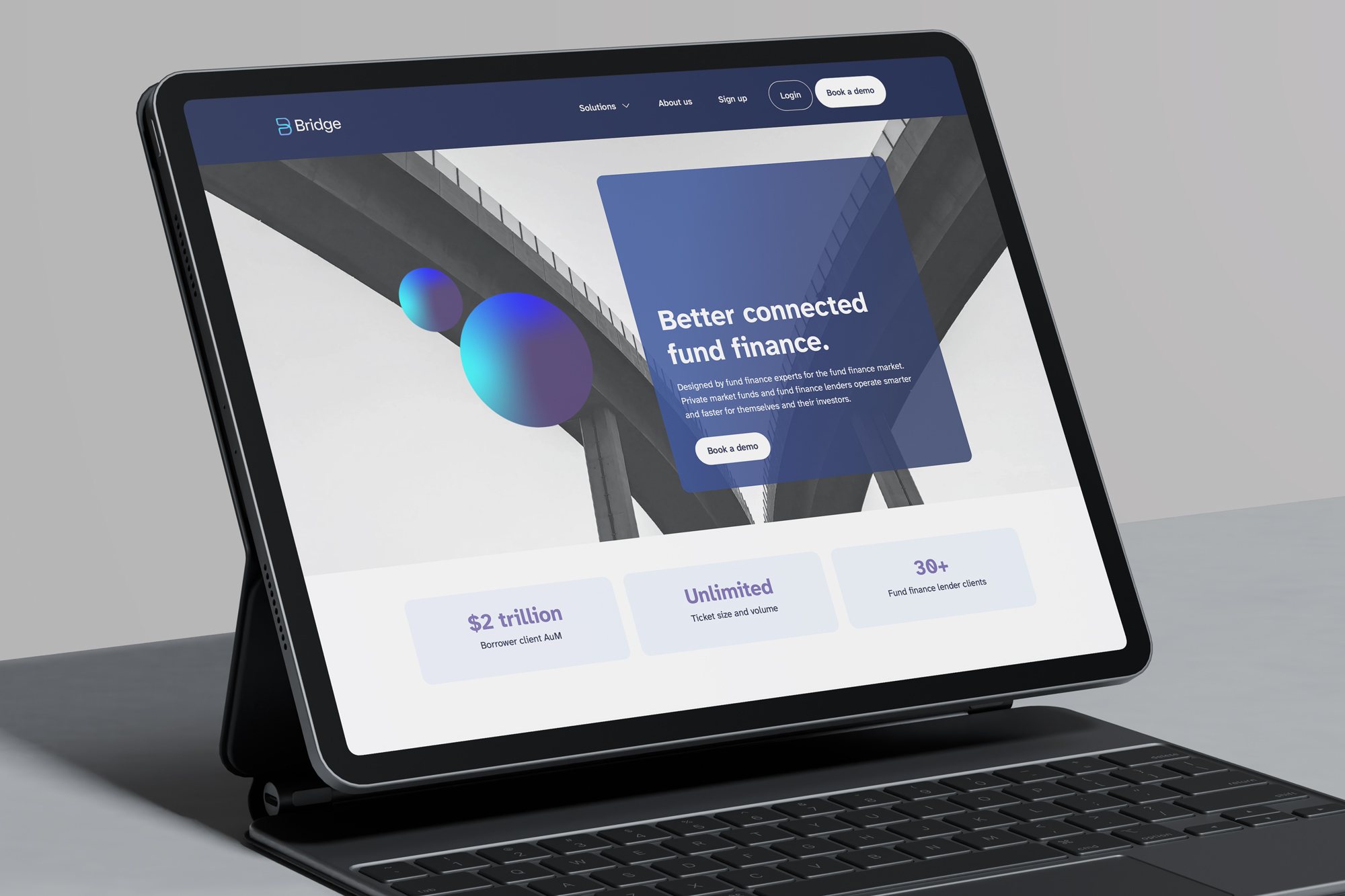
The sphere colours that float over the gradients are the same colours as the website’s primary and secondary buttons. The identity and the product are one system, not a logo bolted onto a template.
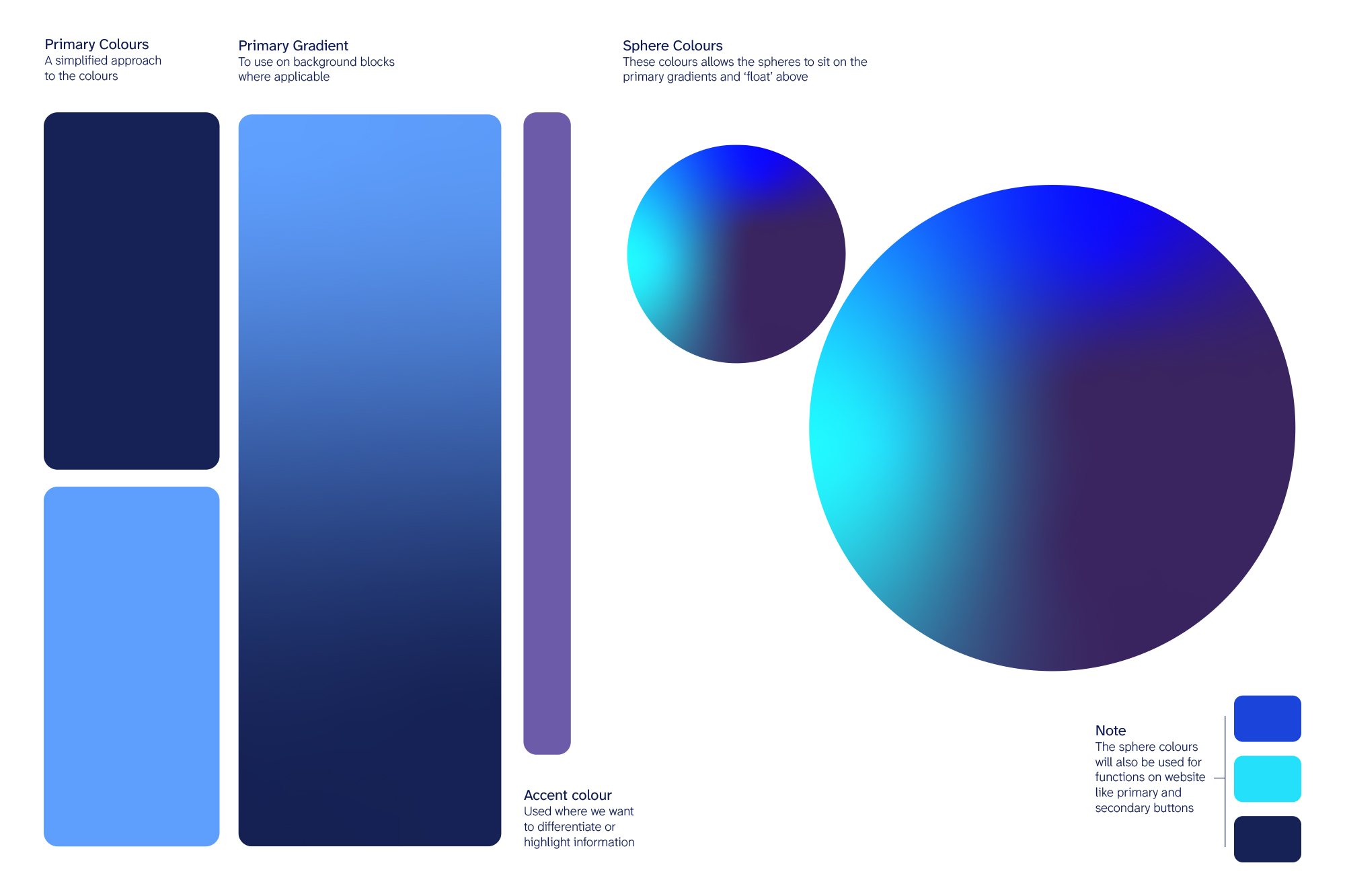
Colour page: primary navy and blue, the primary gradient and the sphere colours.
The palette, with the sphere colours that become buttons.
The Bridge website on a tablet: Better connected fund finance.
The website, live.
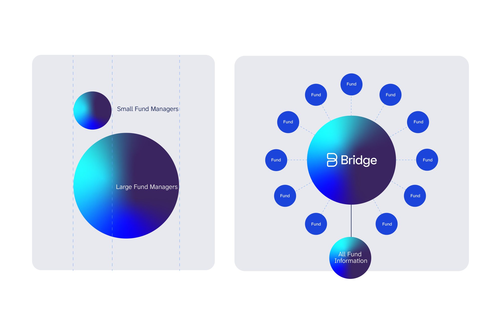
Diagrams in the Bridge style: spheres for small and large fund managers, and Bridge at the centre of a ring of funds.
Diagram language: the spheres become the information.
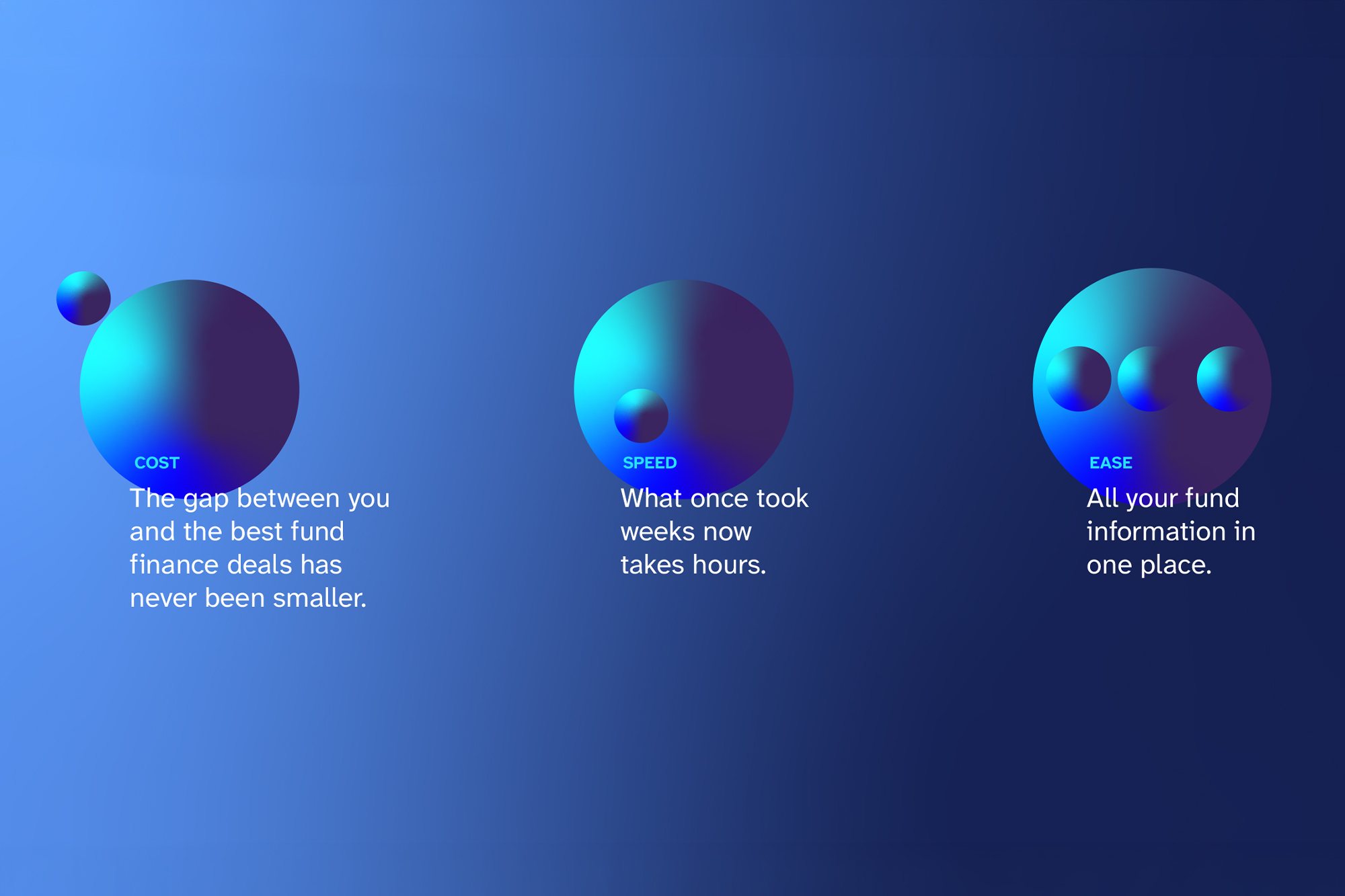
Explainer graphics: cost, speed and ease, each with a sphere.
Explainer graphics.

Who did what

After discovery sessions with the founding team, I developed the identity and led the rollout: website, presentation templates, a white paper, press advertising, events and a video storyboard. A creative director wrote the copy, including “No-one connects like us” and “Cost, speed, ease. Pick all three”. A digital designer and the development team built the site with me, and client services ran the account.

What happened next

The identity is live across Bridge’s website, presentations and marketing.