Stephen Donohue

Case study 01 of 06

The building was the brand all along.

Client
TR Hayes Furniture, Bath
Year
2026
My role
Creative lead: positioning, identity, tone of voice, signage
Team
Me; a mid-weight designer on web; Fiora client services
Disciplines
Strategy, identity, copywriting, environmental graphics
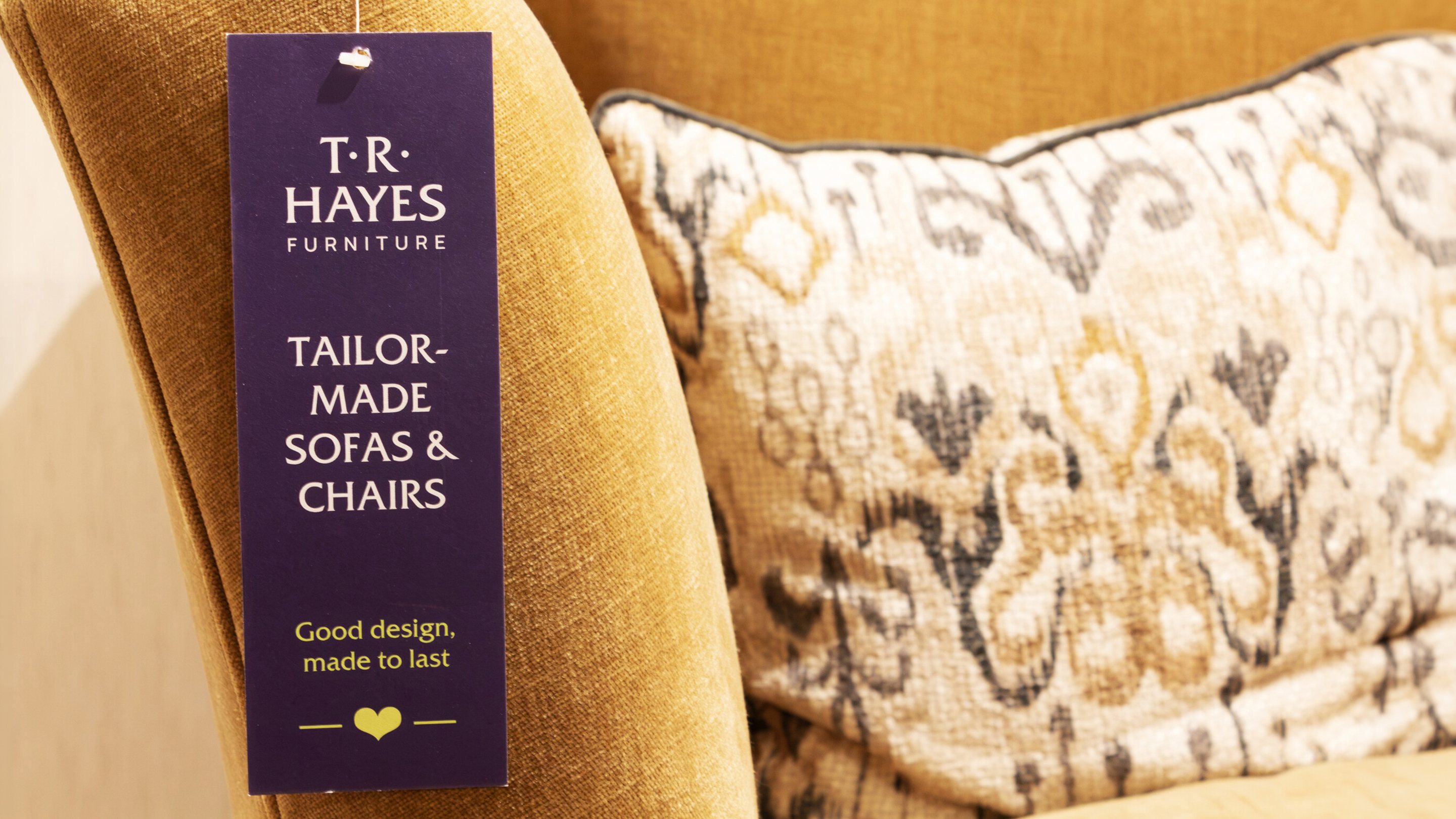
A navy T·R·Hayes swing tag on a mustard sofa beside a patterned cushion: Tailor-made sofas & chairs. Good design, made to last.
Swing tag on the shop floor. The brand at the scale of a single sofa.

The brief

TR Hayes has sold furniture in Bath since 1915. Four generations on, it is still family owned, trading from seven floors of joined Grade II listed townhouses on Walcot Street, with a second showroom, the Paragon, across the road.

Bath knows it well. Much of the wider region has never been through the door. The brief was to give a much-loved local business a brand that could travel further without losing what made it worth the trip.

The centre

Nobody else in the region has a building like it. Customers wander a maze of real rooms, not a warehouse floor. So the brand starts there. The façade became the graphic device and the two stores became its stage. I gave it a line to live up to: the Home of Bath’s Homes.

The idea

A brand that looks like the street it lives on and talks like a knowledgeable friend. Friz Quadrata, a carved serif, echoes architectural lettering, while Manrope does the everyday work. Black and white carries anything permanent. Showroom Navy and Upholstery Pink do the talking, with Lamp Yellow kept for accents.

Line drawings of both buildings run through print, digital and the windows. The writing is plain and specific: Seven floors of home inspiration. The store you haven’t discovered yet.

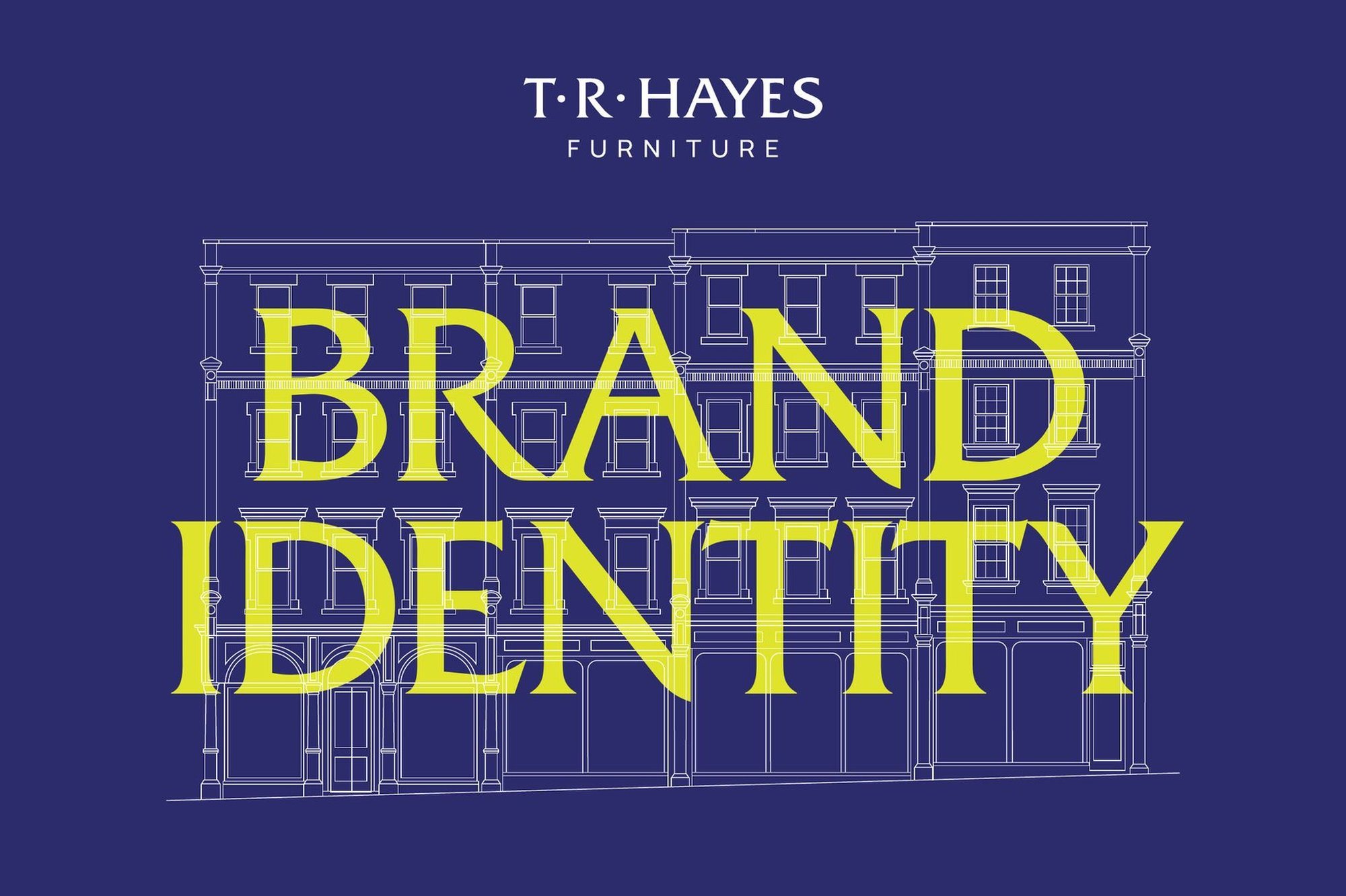
TR Hayes brand book cover: a line drawing of the Walcot Street façade in white on Showroom Navy, with “Brand identity” set large in Lamp Yellow.
Brand book cover. The façade drawing is the main graphic device.
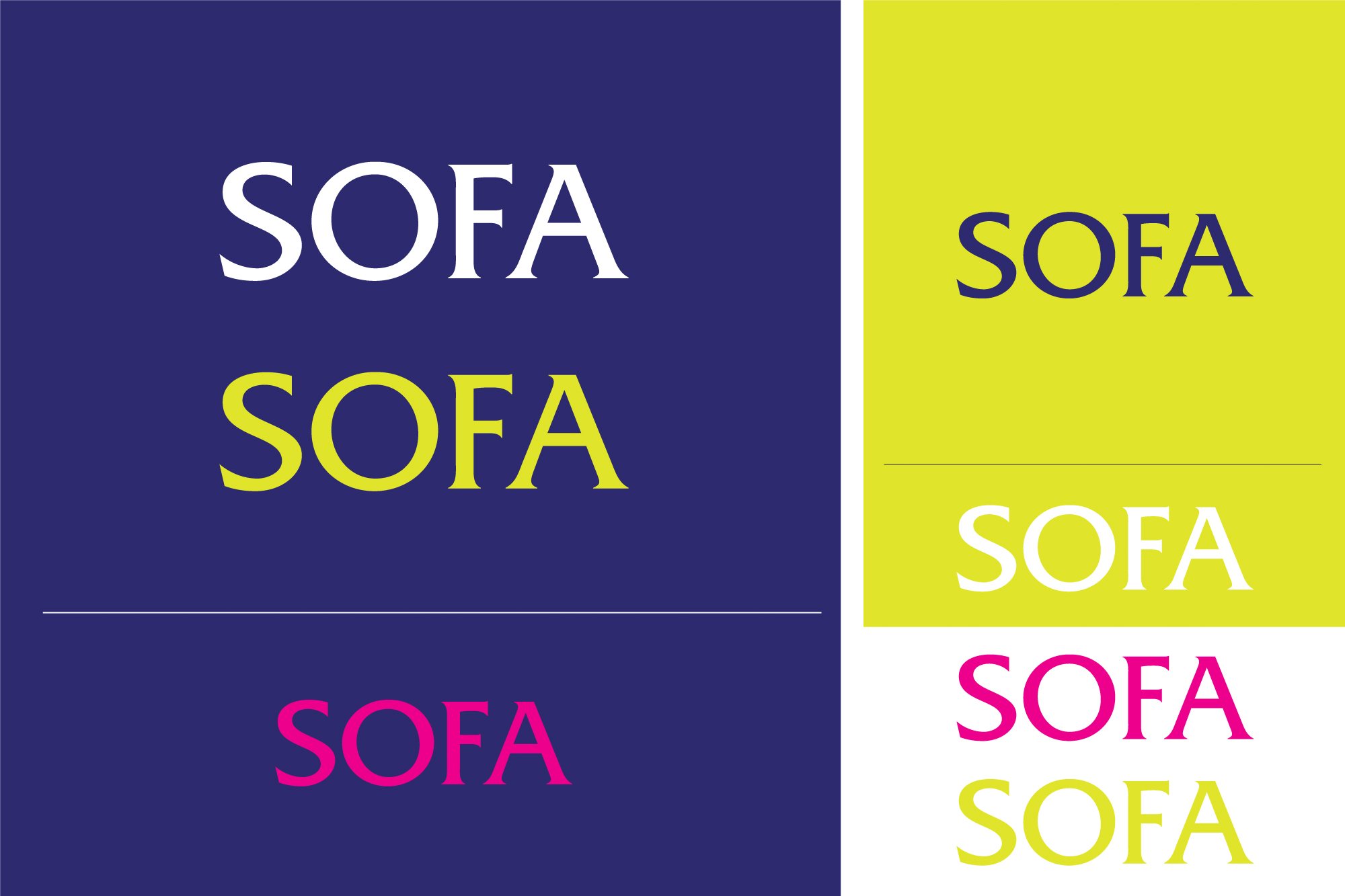
Colour page: the word SOFA set in white, yellow and pink on navy, and in navy, white, pink and yellow on and off a yellow panel.
Colour combinations, tested for contrast.
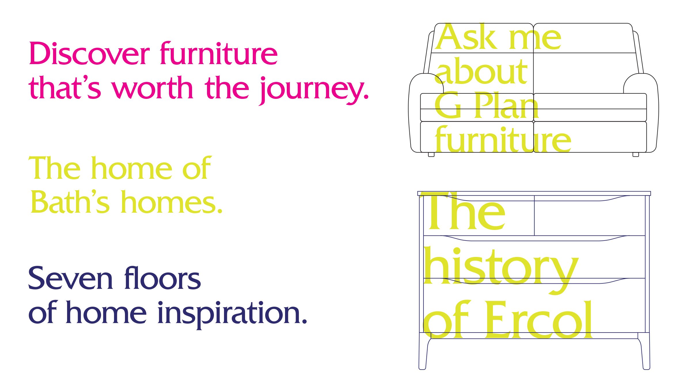
Brand lines in pink, yellow and navy: Discover furniture that’s worth the journey. The home of Bath’s homes. Seven floors of home inspiration. Beside them, Ask me about G Plan furniture and The history of Ercol set over line drawings of furniture.
Lines from the messaging framework, all written for the brand.

Three decisions

Black and white for anything permanent.

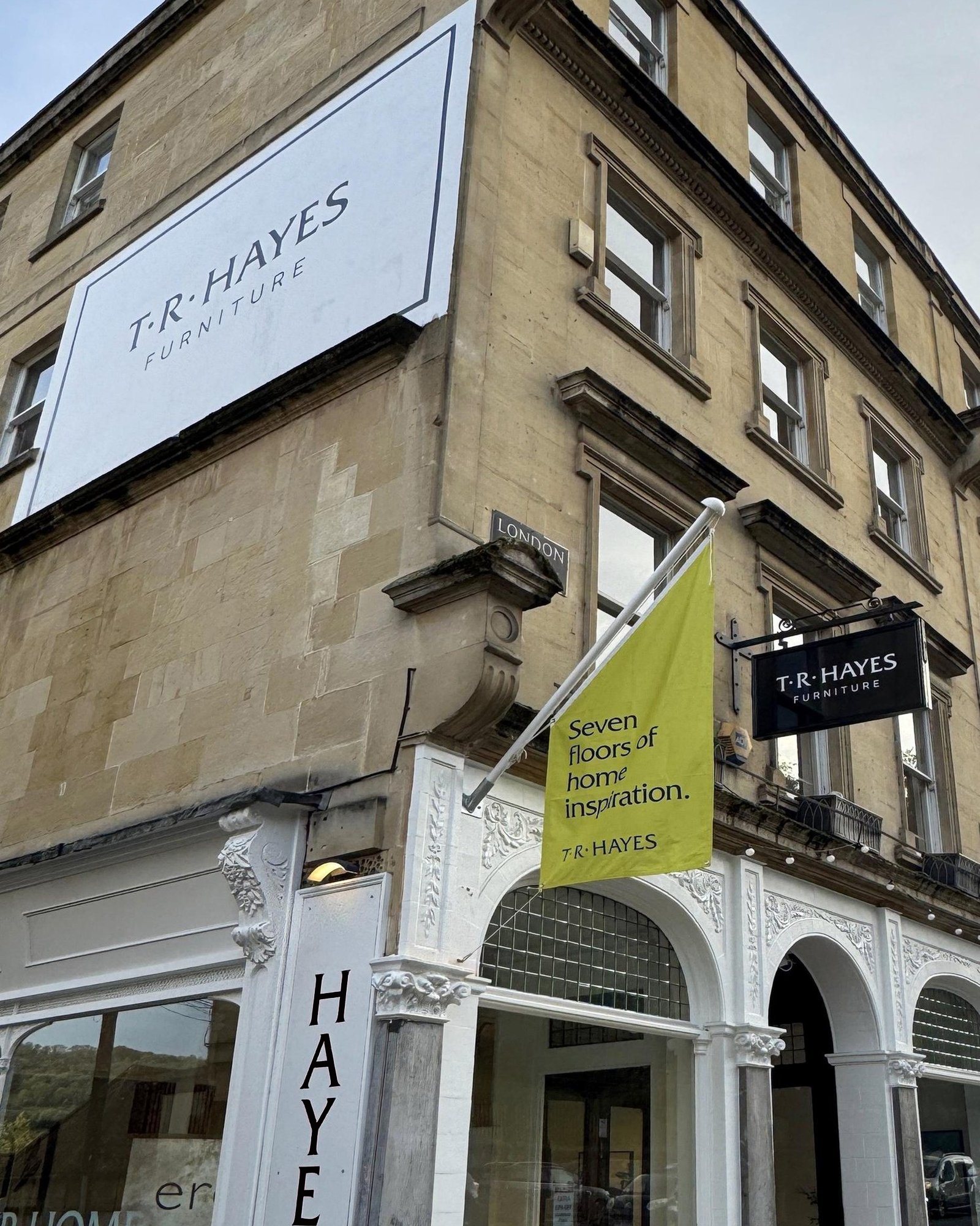
On a listed street, fascias, projecting signs and fixed wayfinding stay monochrome and work with the architecture. Colour is saved for things that change: flags, window messages, posters. The signs give the structure; the colour carries the conversation.
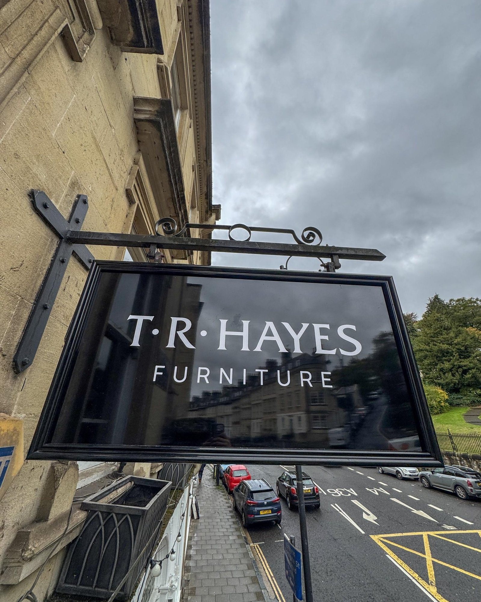
The black T·R·Hayes Furniture projecting sign on its wrought-iron bracket, seen from below against a grey sky, with the street beneath.
The projecting sign, black and white on a traditional bracket.
The corner of the Bath stone building: a large white T·R·Hayes wall sign high up, a yellow flag and the projecting sign above the shop front.
The wall sign, flag and projecting sign together on the corner.

A window that changes without new hardware.

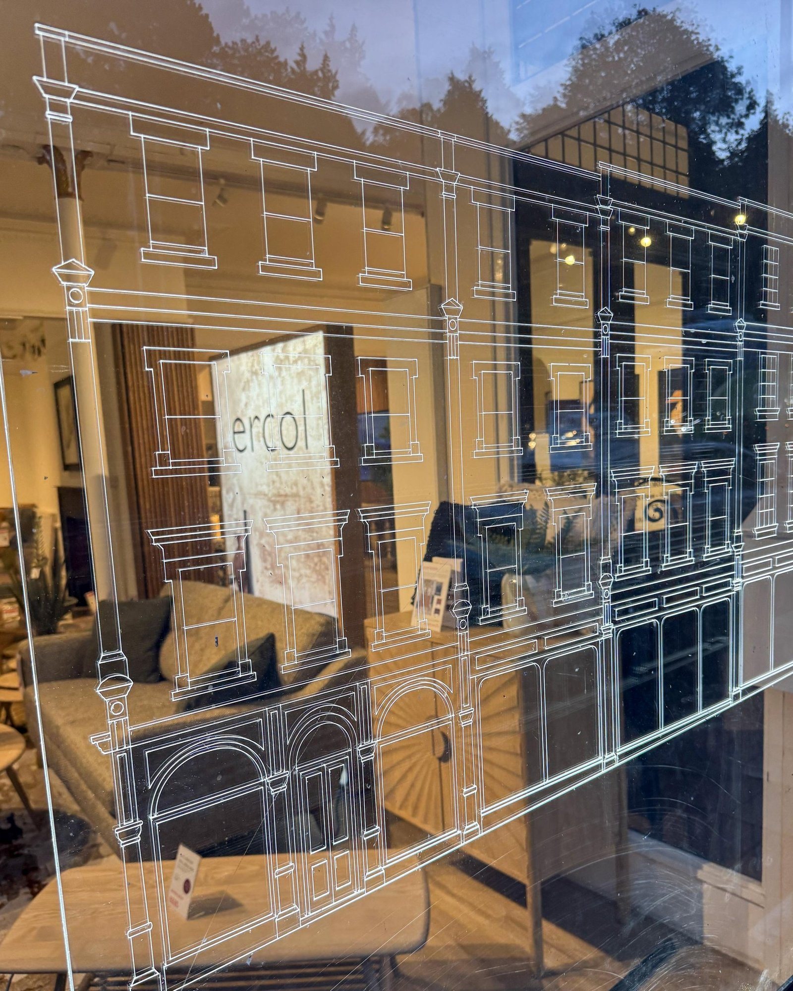
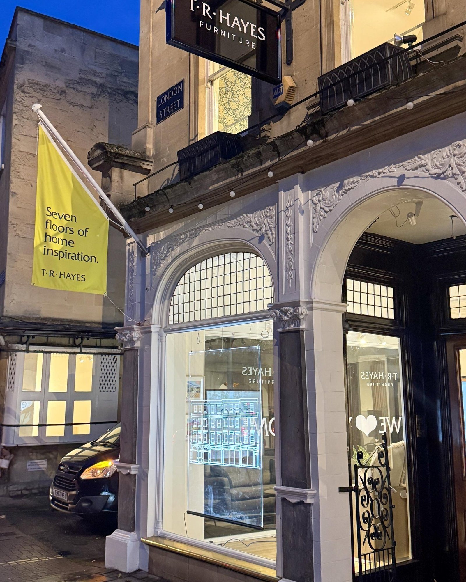
The showstopper is designed in two layers: a CNC-engraved, edge-lit acrylic drawing of the building in front, and a printed fabric message behind it. The drawing stays; the message can change with the seasons and campaigns. It hangs clear of the window frame, so passers-by still see into the showroom. It works as an invitation, not a wall.

Close-up of the clear acrylic panel engraved with a line drawing of the Walcot Street façade, with the showroom visible through it.
The engraved façade. Edge-lit, it draws in white light.
The arched London Street shop front at dusk, with the engraved acrylic lit in the window, a yellow flag and the projecting sign above.
In the window at dusk.

Rules for writing, not just lines.

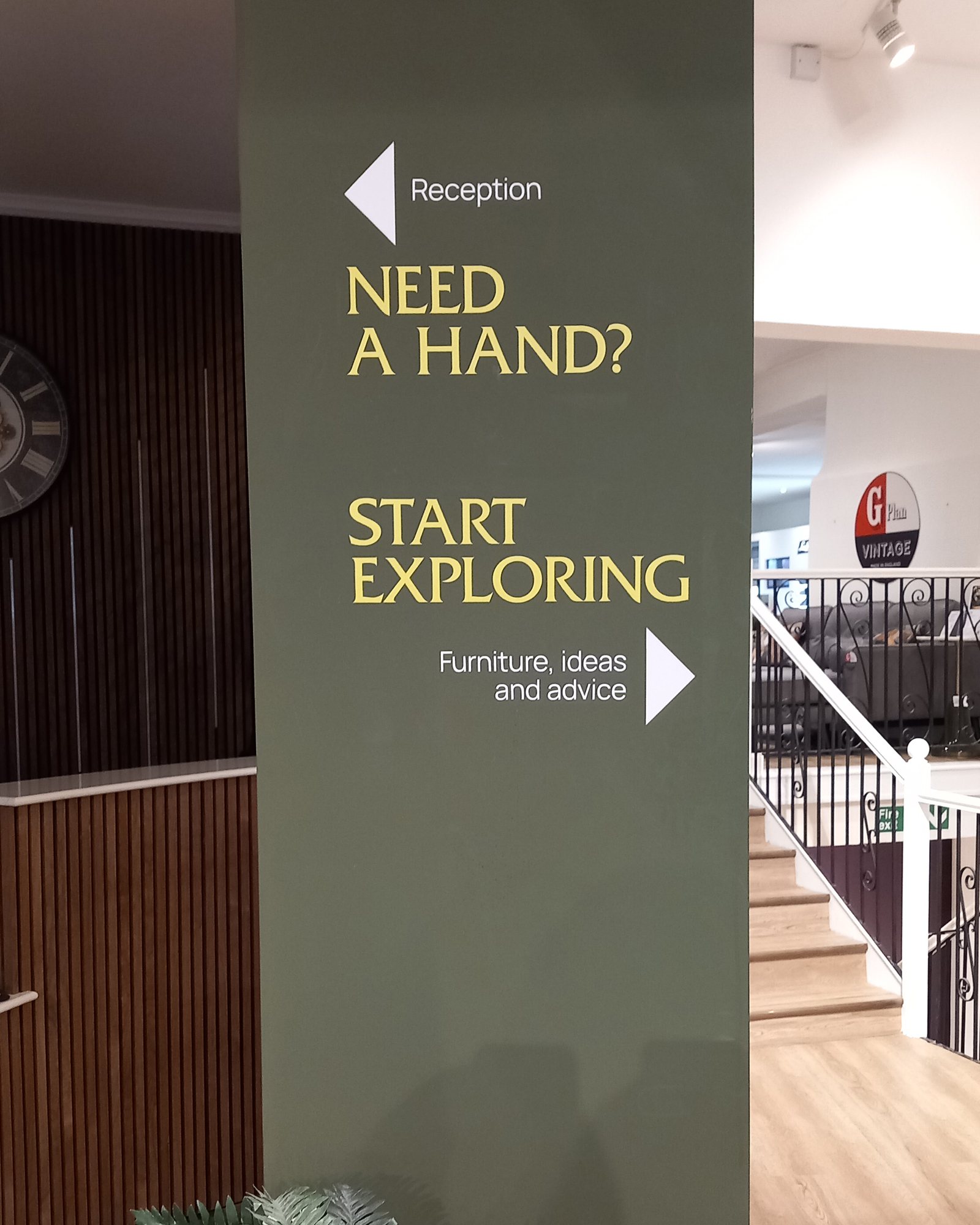
I wrote a tone of voice anyone writing for TR Hayes can use: explain, don’t hype; be specific rather than superlative; stay warmly British. Product copy, emails, social and signage can all sound like the same shop. Even the pillar inside the door speaks it: Need a hand? Start exploring.

A painted pillar inside the Walcot store entrance, pointing left to reception with “Need a hand?” and ahead with “Start exploring”.
Arrival wayfinding. One simple choice at the door, in the brand’s voice.
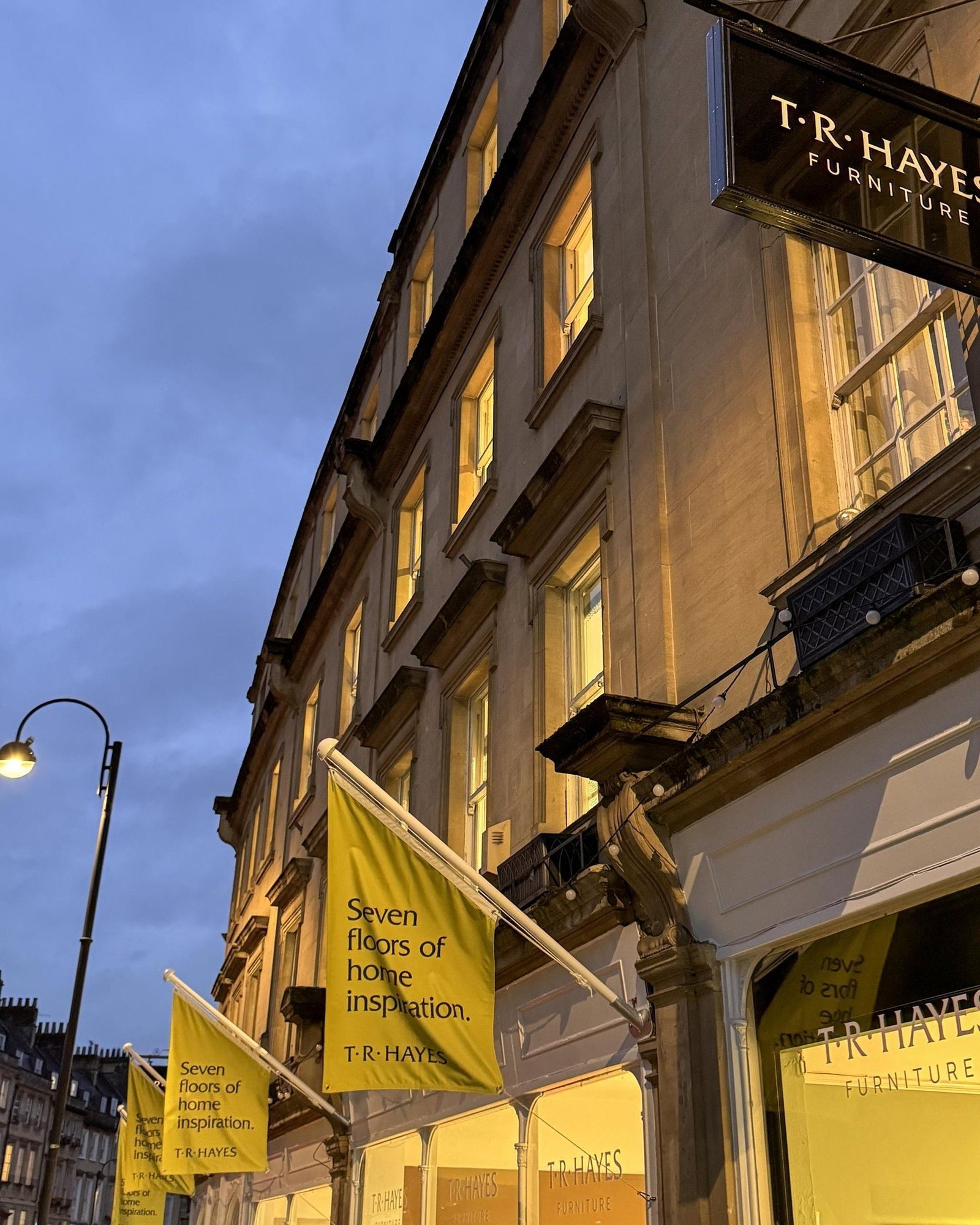
Yellow flags reading Seven floors of home inspiration along the lit Walcot Street frontage at dusk.
Street flags. The line does the selling.

Who did what

I led and designed the work from positioning to signage: the strategy and messaging, the identity, the tone of voice and the signage system. I wrote the lines, including the Home of Bath’s Homes. A mid-weight designer is working with me on the website designs. Fiora’s client services team ran the relationship and reviewed the work with me.

What happened next

The brand book has been delivered and the signage is installed at Walcot Street: the projecting signs, wall sign, flags, arrival wayfinding and the engraved window. The website designs are in progress.