Let the icons carry the idea.
Play, pause and repeat need no explanation and no translation. They work as a headline, a graphic device and a punchline in each scene, from a phone screen to a pull-up banner.
Case study 02 of 06
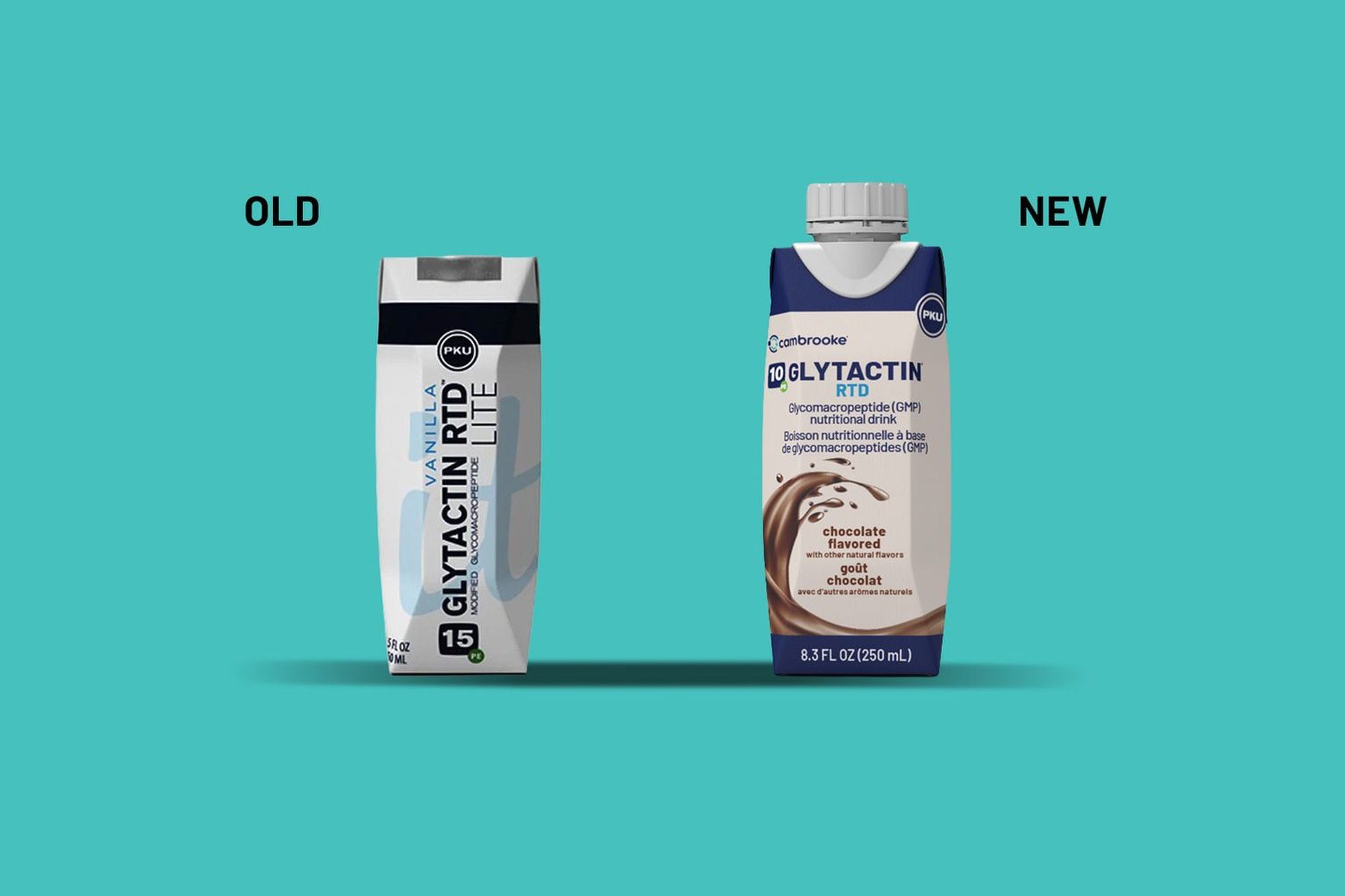
People living with PKU and TYR rely on specialist nutritional drinks every day. Cambrooke was replacing the foil seal on its cartons with a resealable screw cap.
On paper, it was a packaging update. In practice, the foil meant drink it now or lose it. The brief was to launch the cap in a way that meant something to the people using it.
People living with PKU don’t see themselves through their condition. They are students, commuters, parents and friends, with days that move to their own rhythm. The foil seal interrupted that rhythm, and the cap gives it back. It doesn’t change the formula. It changes the day.
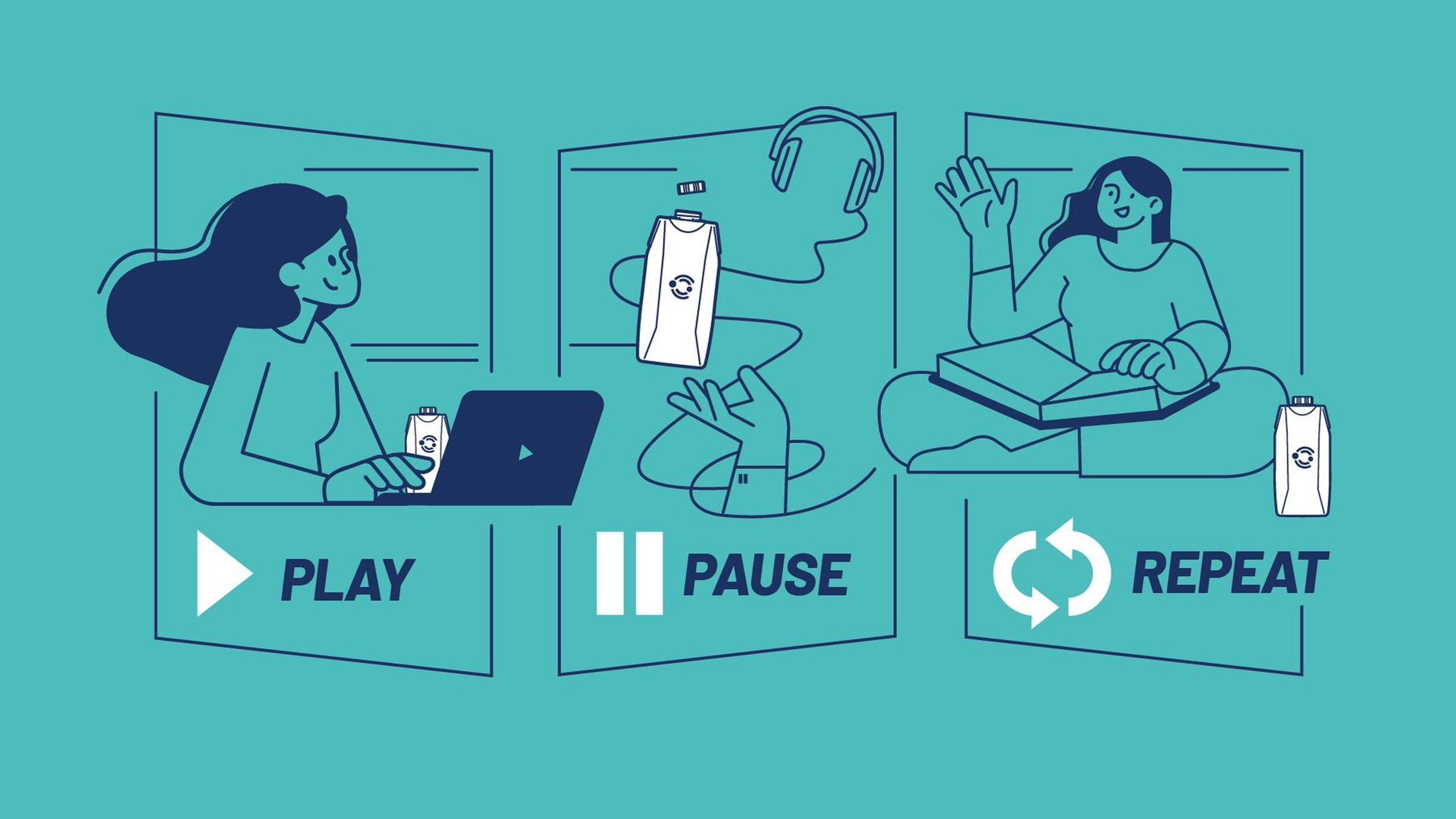
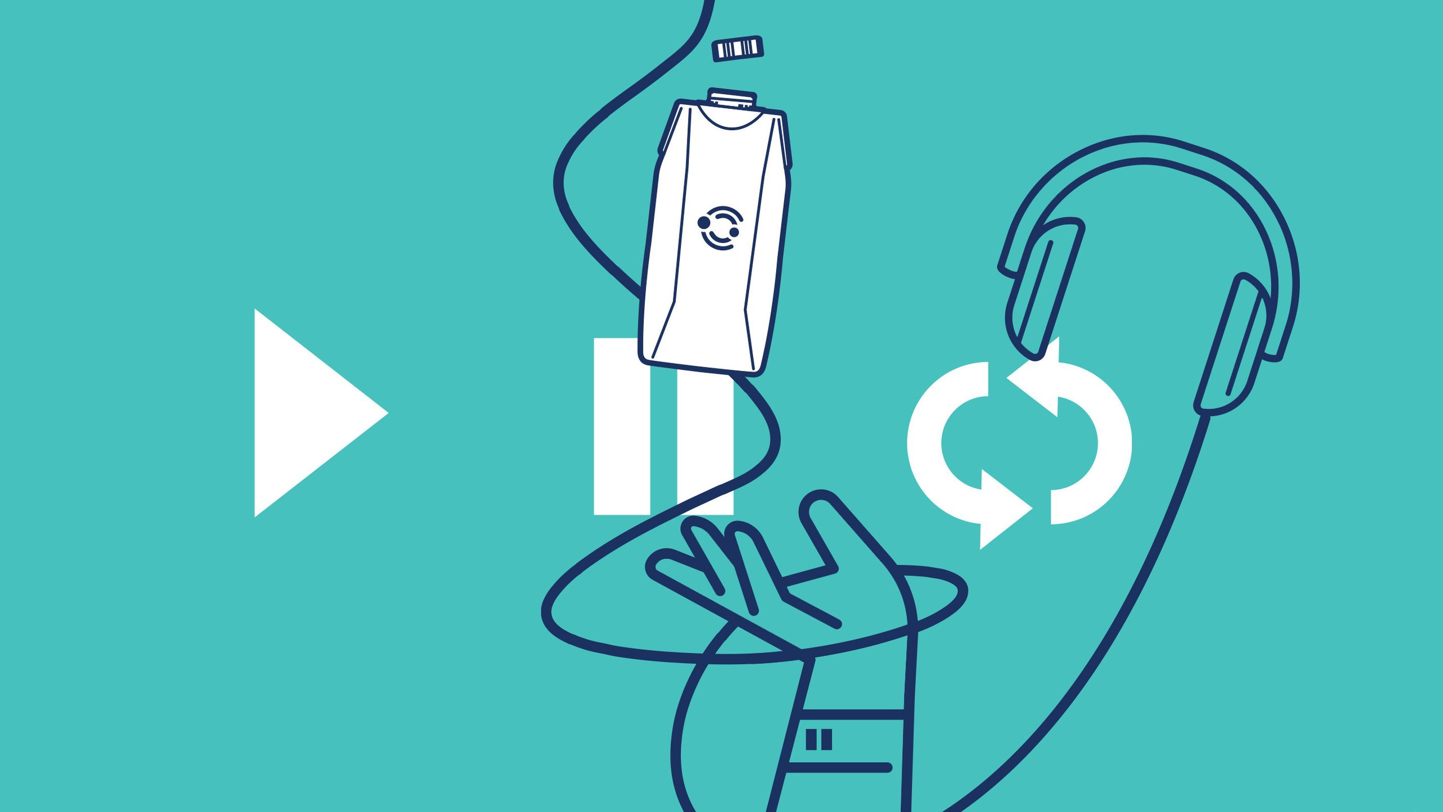
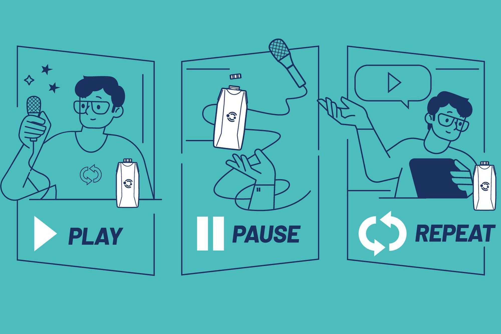
Play. Pause. Repeat. Three media-player icons everyone already understands, each mapped to a moment of the day. Play: get on with it. Pause: twist the cap, take a drink. Repeat: reseal it and carry on.
It reads less like healthcare communication and more like a celebration of ordinary life. An animated film sets the pace, and every other touchpoint follows it.
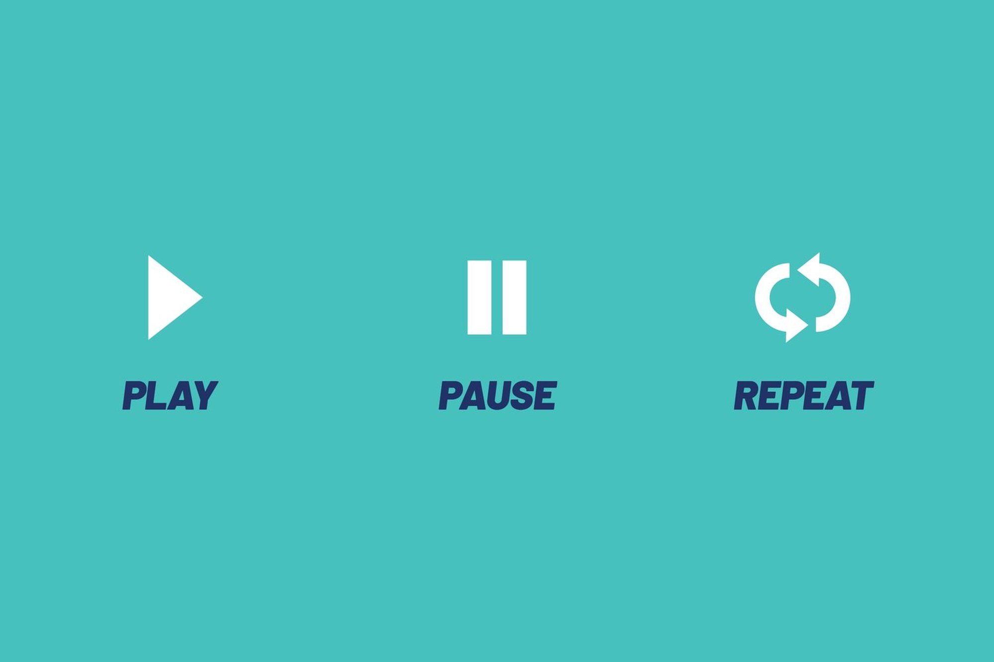
Play, pause and repeat need no explanation and no translation. They work as a headline, a graphic device and a punchline in each scene, from a phone screen to a pull-up banner.
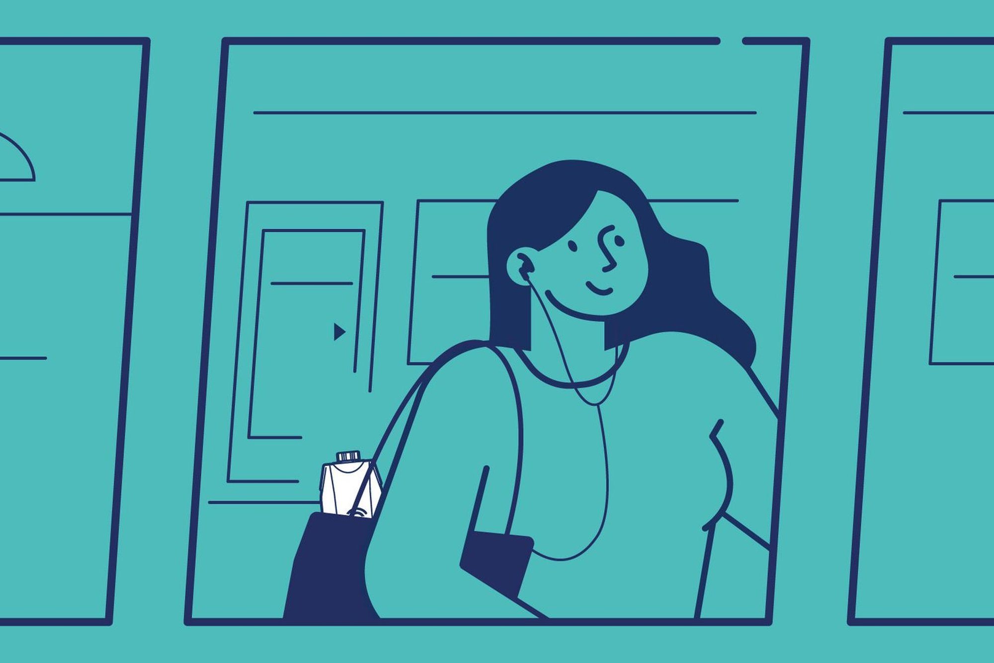
The characters work at laptops, take calls and study on the sofa, with a carton in hand. The drink fits around life, which is the whole point of the cap. I developed the illustration style from a reference and drew the characters and the product.
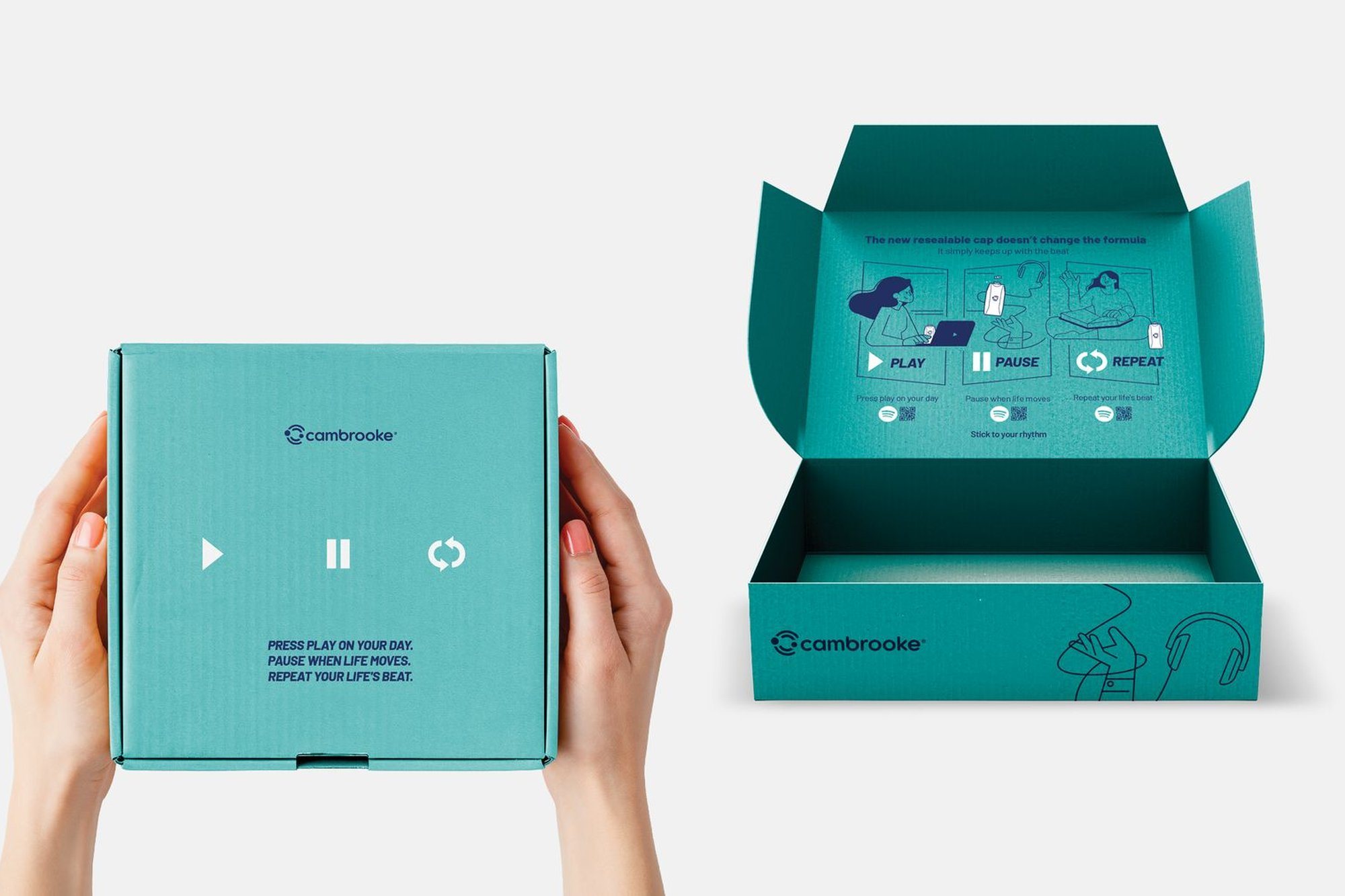
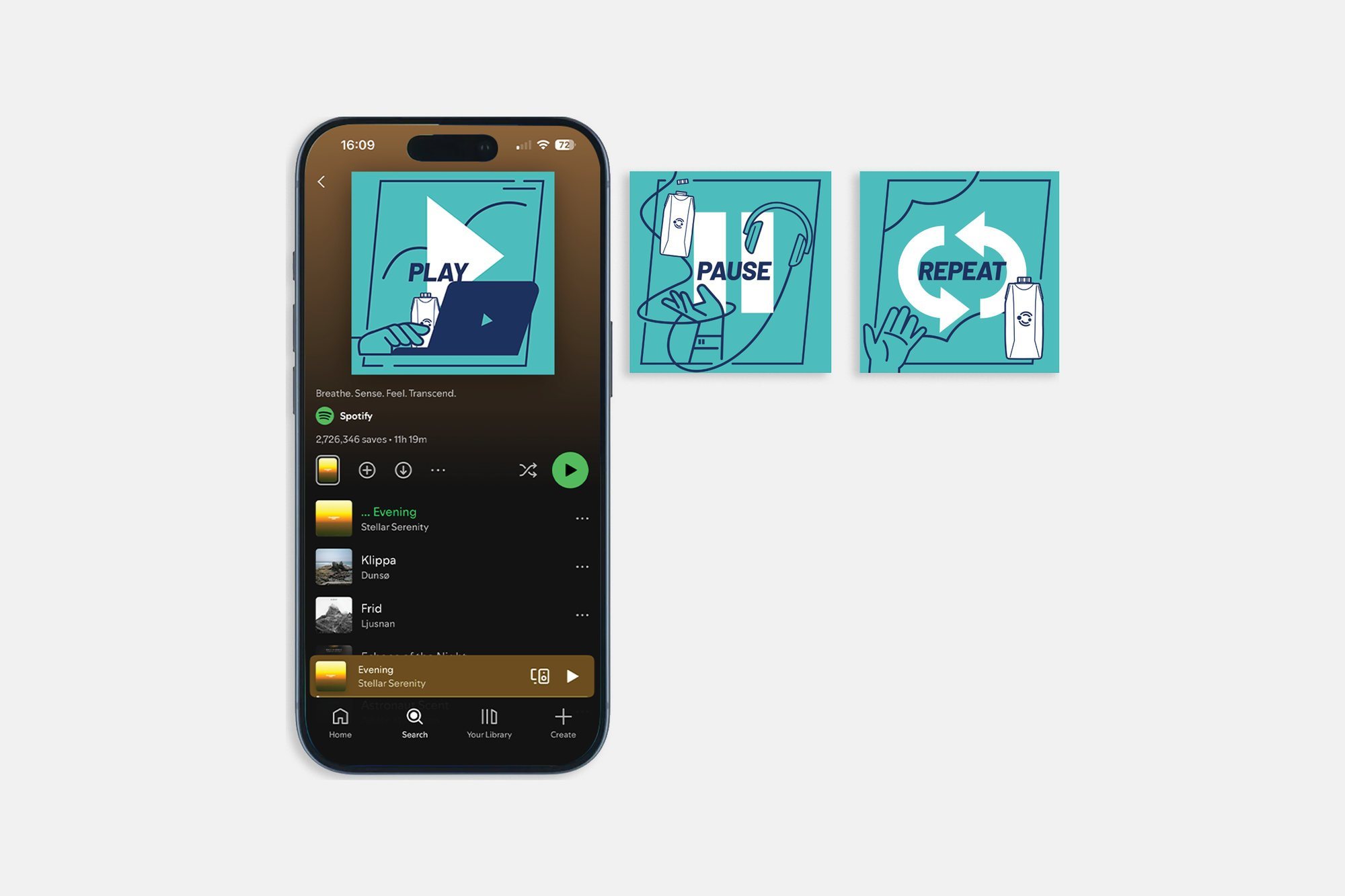
The sample box carries three QR codes, one under each word. Each links to a Spotify playlist for that moment: one to keep you moving, one for a pause, one for the comfort of routine. The metaphor doesn’t just sit on the packaging. It plays.
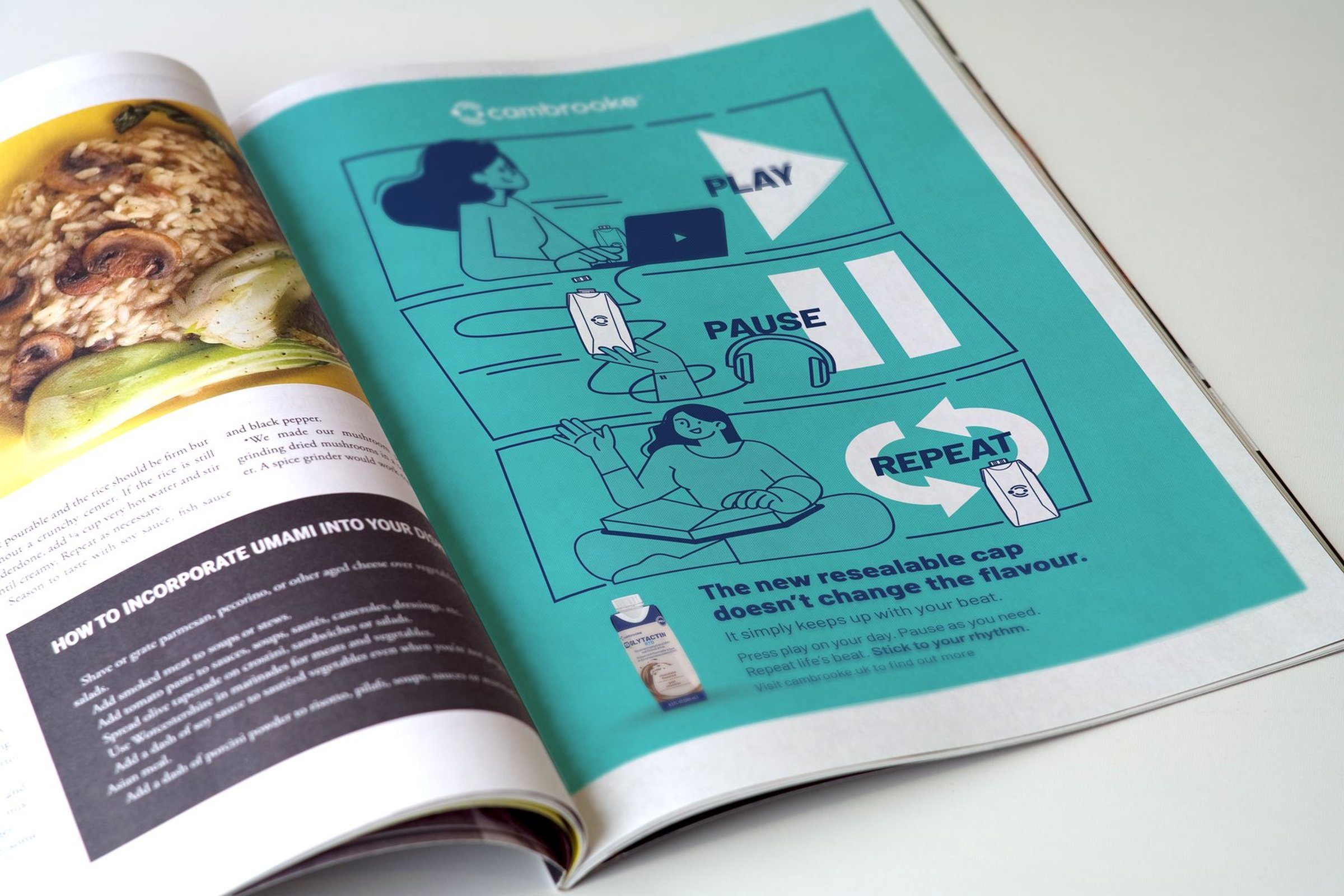
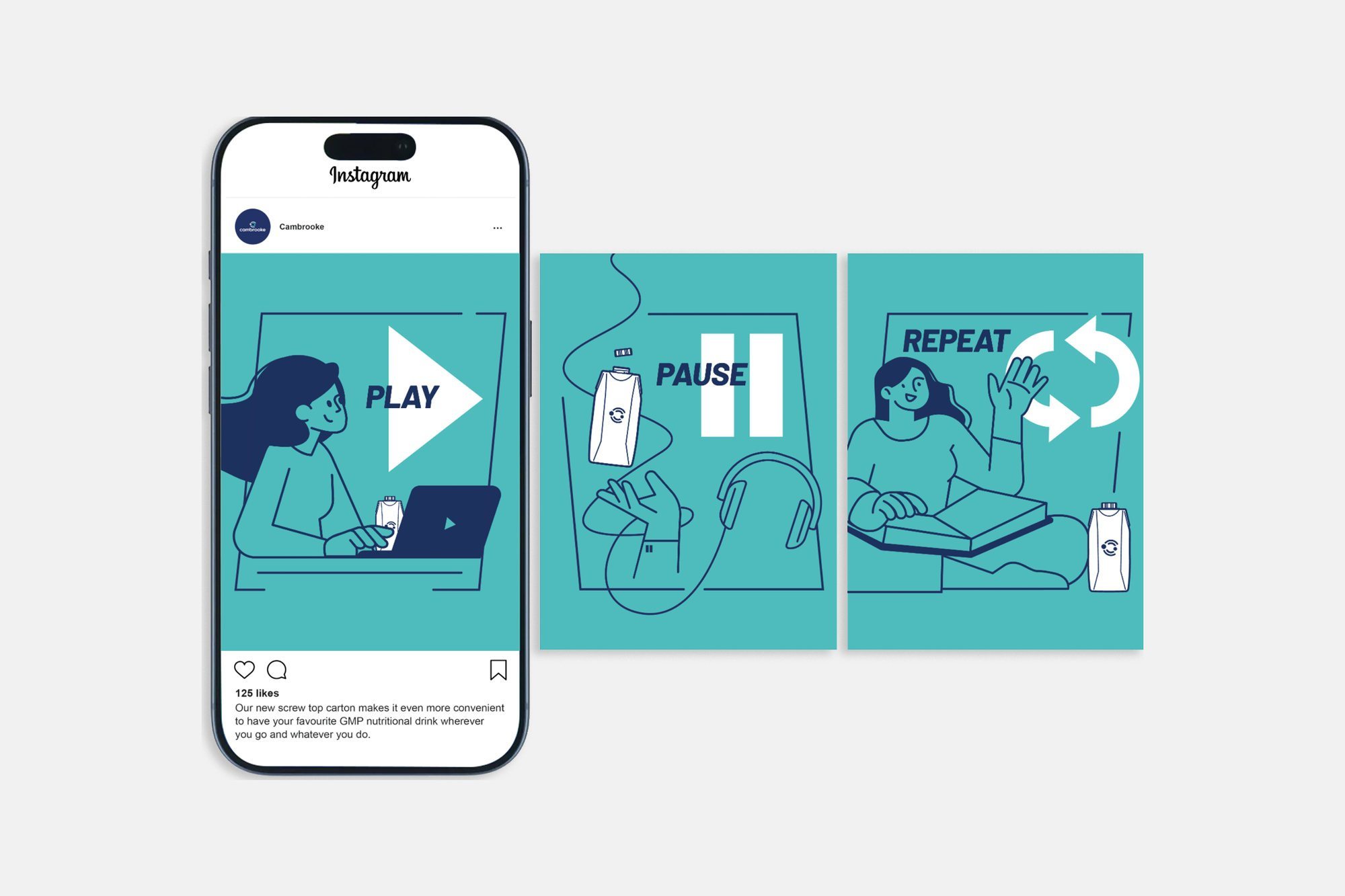
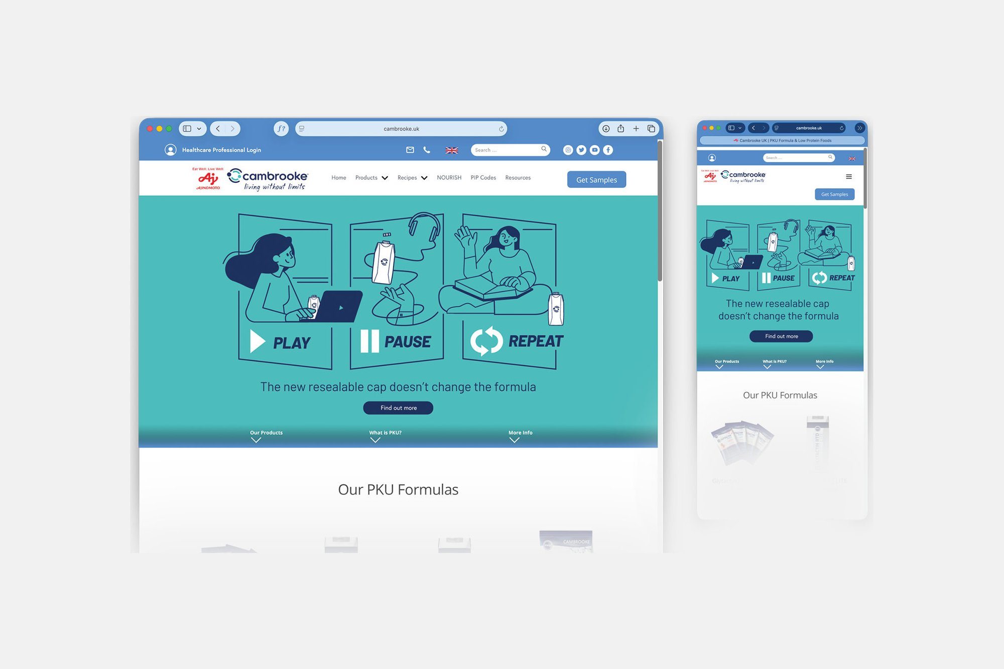
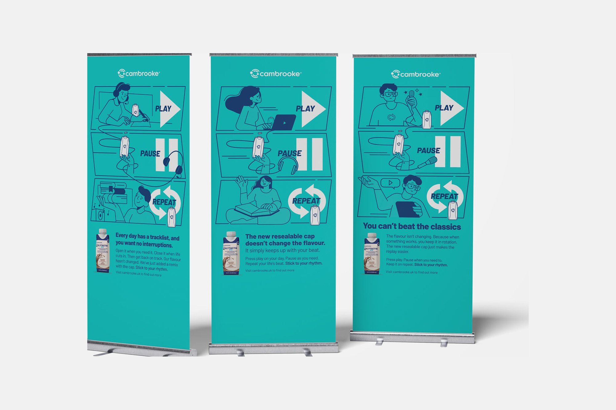
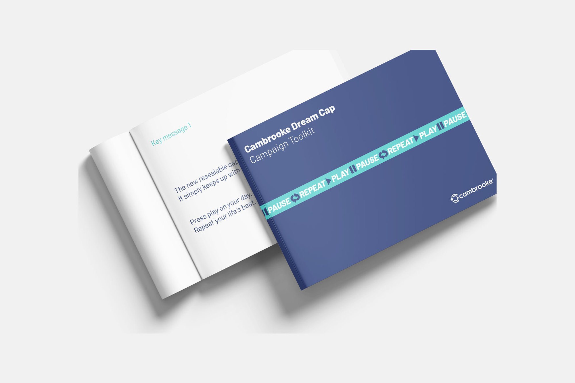
The line came out of brainstorming sessions with the creative team. My job was to pick it out and shape it into a campaign. I developed the illustration style, drew the characters and the product, and directed the motion designer who animated the film.
The sample kit has now been sent to all clinics across the DACH region and has been incredibly well received. Since launching the campaign across our website and social channels, we received 34 sample requests in the last month alone, a really significant number given the niche area in which we operate.
The sample kit went to every clinic across the DACH region. In its first month online, the campaign brought 34 sample requests.