Stephen Donohue

Case study 05 of 06

Everyone loves a tiger. We made room for the vultures.

Client
Noah’s Ark Zoo Farm (registered charity)
Year
2024
My role
Sole designer, with full design control: identity, graphic language, rollout
Team
Me; Noah’s Ark’s in-house creative team on their own channels
Disciplines
Identity, fundraising campaign, environmental graphics, social
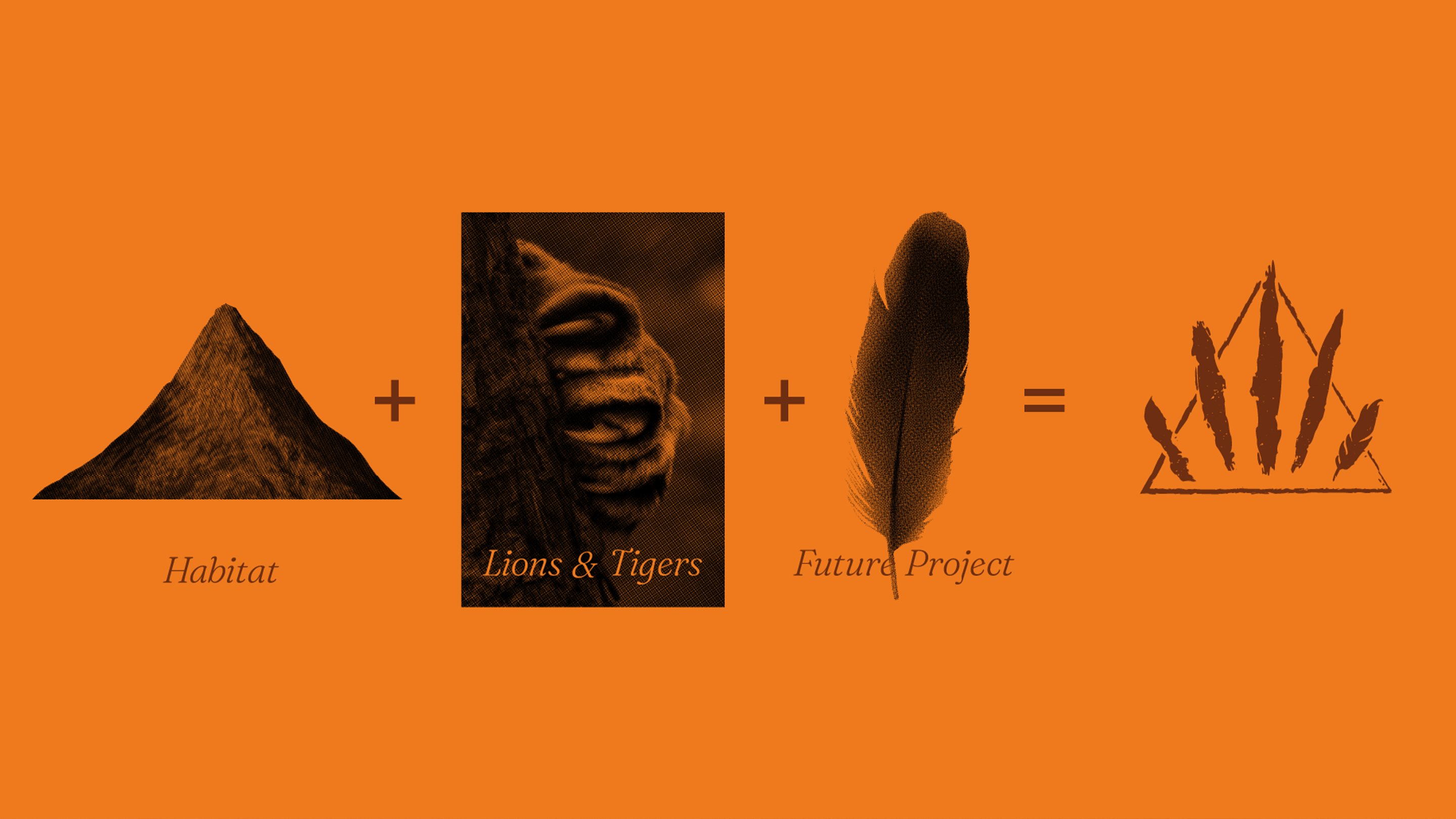
On orange: a mountain labelled Habitat, plus a claw-scratched panel labelled Lions & Tigers, plus a feather labelled Future Project, equals the Project Carnivora mark.
How the mark adds up: habitat, claw and feather.

The brief

Project Carnivora is a multi-phase project to rebuild and create habitats for threatened carnivores: African lions, tigers, Arctic foxes and hooded vultures.

It needed an identity that could raise funds, educate visitors and sign the new spaces. The visual brief had three points: habitat conservation, carnivores (vultures included) and natural colour.

The centre

One project, four very different animals, and one of them nobody finds cuddly. The mark had to belong to all of them.

The idea

A mark that adds up. A triangle for the habitat, a claw for the lions and tigers, and a feather for the vultures, which can stretch to whatever the project takes on next. Together they say carnivore instantly, at any size and in any medium, and the palette comes from earth and fur.

Three decisions

A claw, not an animal.

Picturing one species would have left the others out. The claw covers the big cats, the feathers bring in the vultures, and the same device can extend to animals in later phases. The mark grows with the project instead of being redrawn for it.
The approved Project Carnivora mark in orange on brown: claw slashes and feathers inside a triangle.
The approved mark.
Logo variants: brown on orange and orange on white, with the Project Carnivora wordmark.
Variants for light and dark grounds.

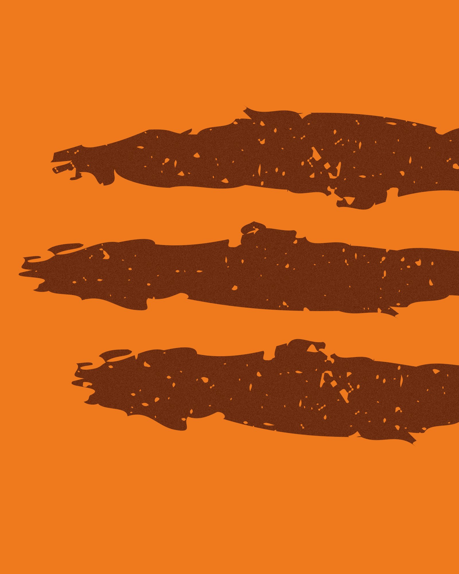
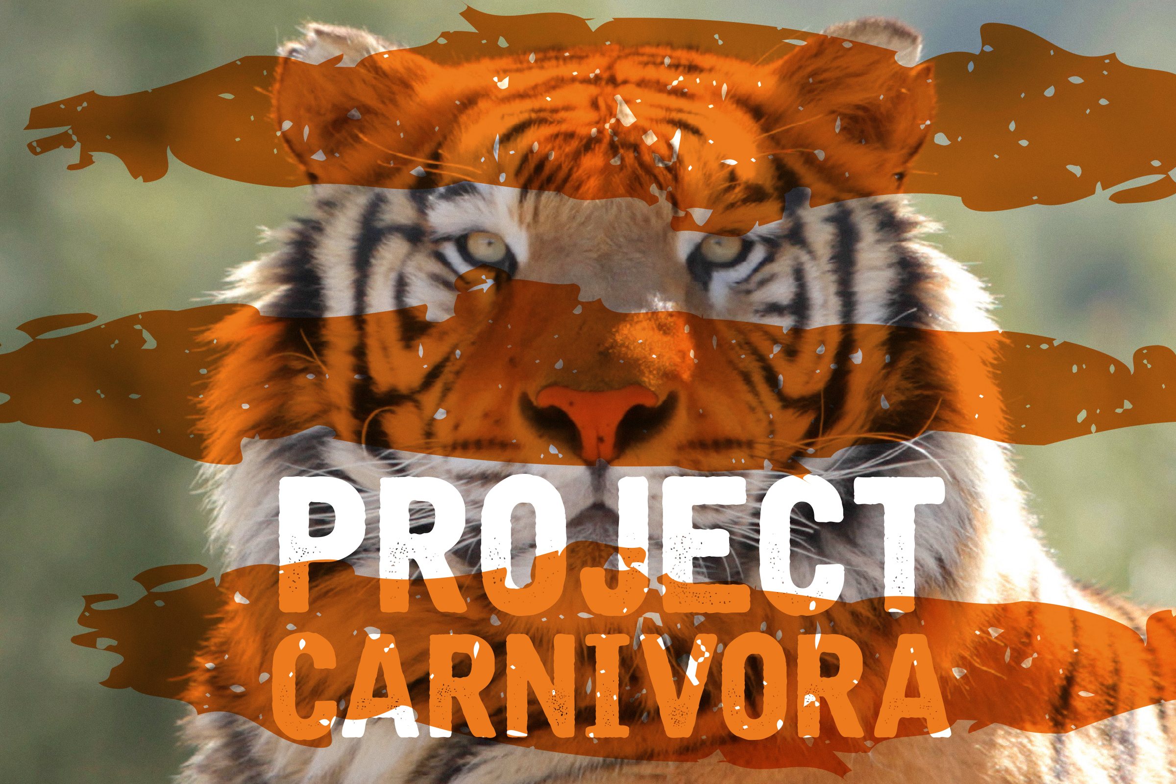
Torn edges as the graphic language.

The same ragged strokes cut through photography, titles and posts, so every piece reads as the same project, whoever makes it.

Torn brown brush strokes on orange.
The torn strokes on their own.
The Project Carnivora title over a tiger’s face, behind torn orange strokes.
The strokes over photography.

Out in public before the habitats opened.

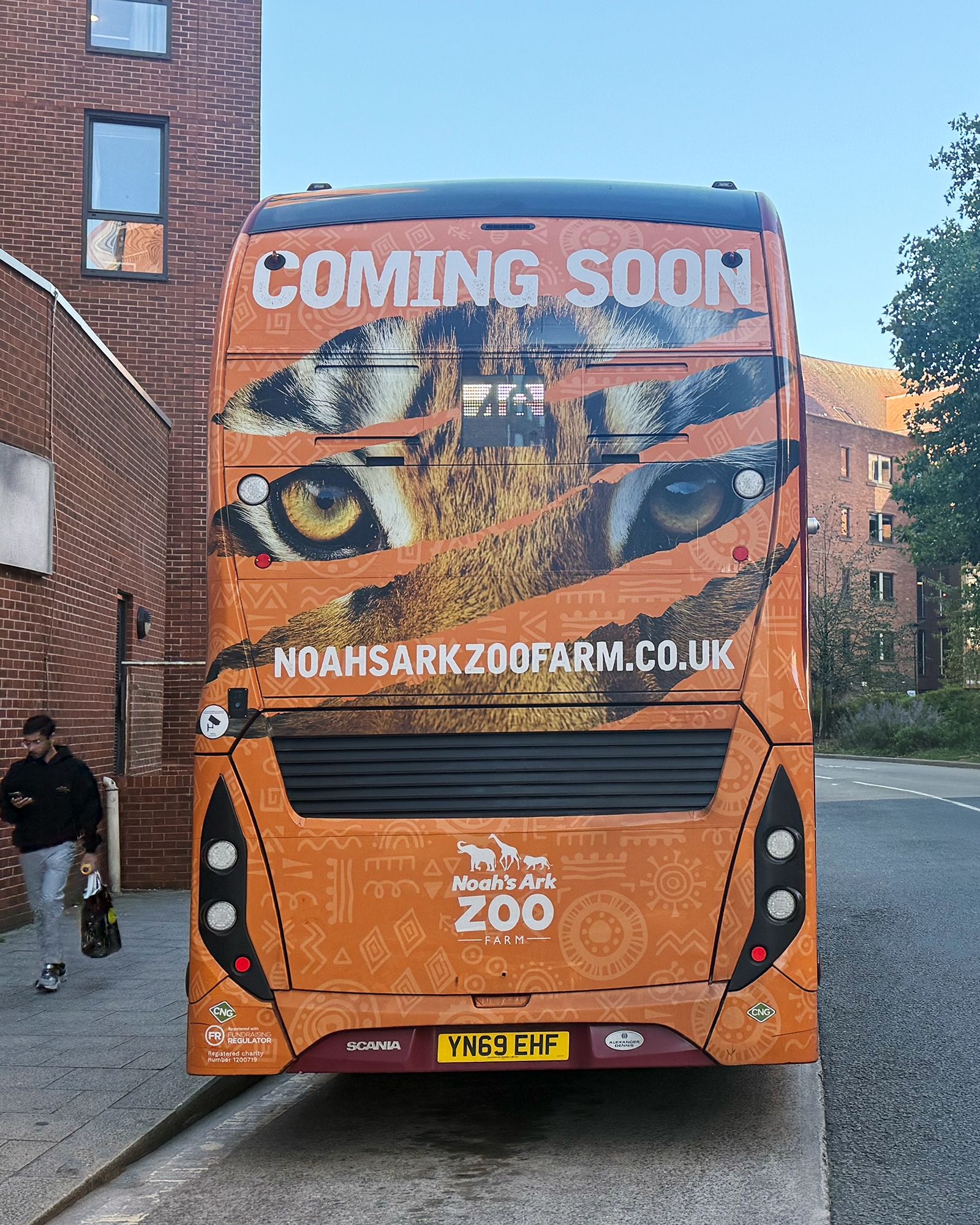
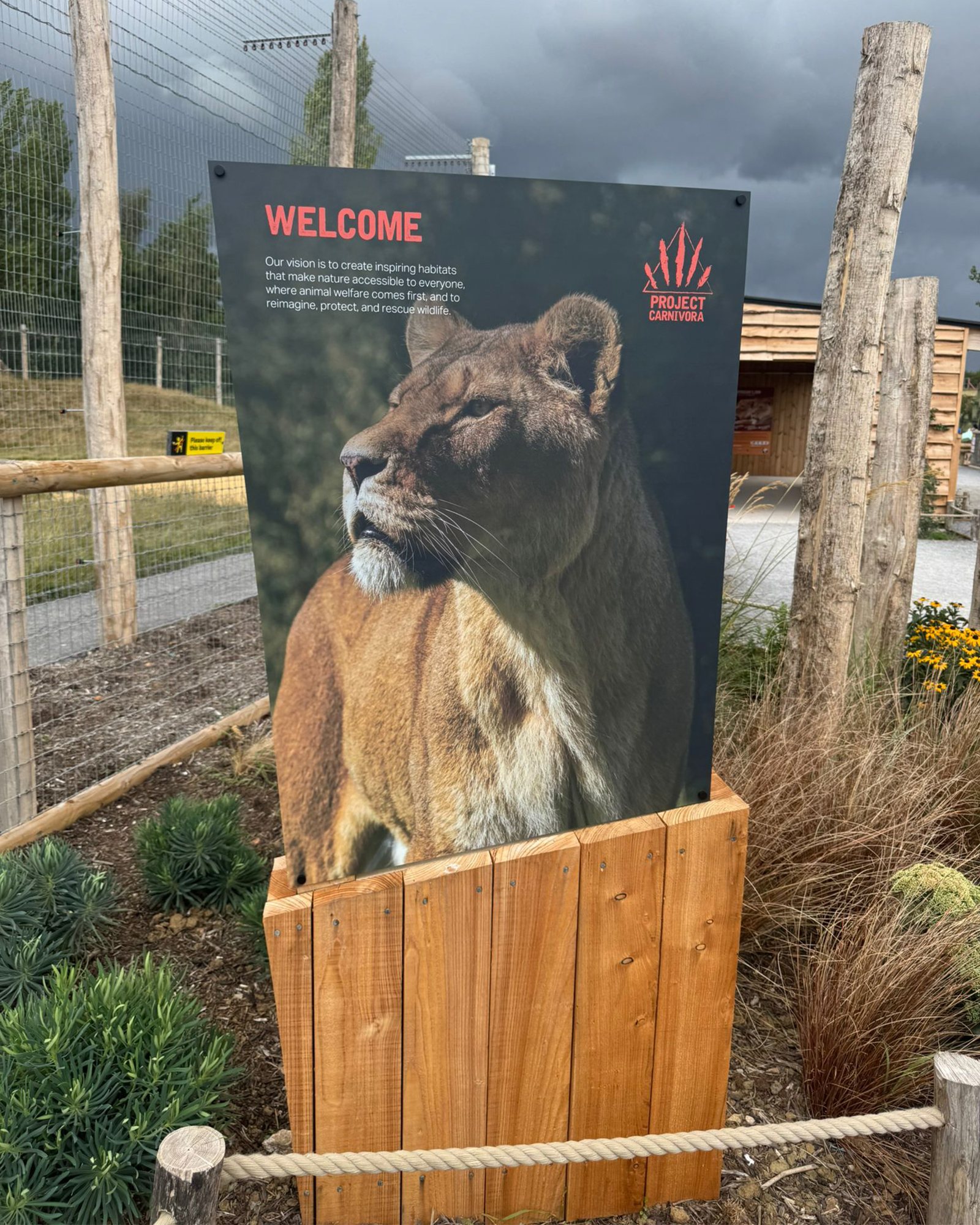
The identity had to raise interest and money while the new spaces were still being built. A “Coming soon” bus wrap took it onto the road, and welcome signs carried it into each habitat as it opened.

A double-decker bus wrapped in orange with tiger eyes and Coming Soon.
The “Coming soon” bus wrap, on the road.
A Welcome sign at the new habitat, with a lioness photograph and the claw mark, set in a timber frame.
Welcome signage at the new habitat.
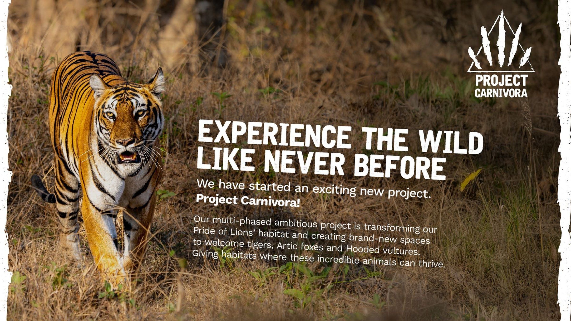
Launch social post: a tiger walking through long grass, with the mark, torn edges and the headline Experience the wild like never before.
Launch social. Photography, mark and torn edges together.

Who did what

I had full design control and designed everything here myself: the mark, the variants, the graphic language and the rollout. Noah’s Ark is a long-term Fiora client with its own in-house creative team, who carried the identity into their channels.

What happened next

The identity went straight into use: a “Coming soon” bus wrap, welcome signage at the new habitats and the Rescue Tiger Appeal. The new lion habitat opened in summer 2025. Aqua, a rescued tiger, arrived that autumn, and the tiger habitat is being completed.